How to Create Custom Components in React.js? Level up your React game! This isn’t just about slapping together some code; it’s about building reusable, maintainable, and downright awesome components. We’ll dive deep into functional and class components, master prop passing, conquer state management, and even style those babies like pros. Get ready to unleash your inner React wizard.
From the basics of component reusability to advanced techniques like higher-order components and render props, we’ll cover everything you need to know to build complex, yet elegant, custom React components. We’ll tackle prop drilling head-on, explore different state management solutions, and show you how to style your components with finesse. Prepare for a journey that’ll transform your React development workflow.
Introduction to Custom React Components
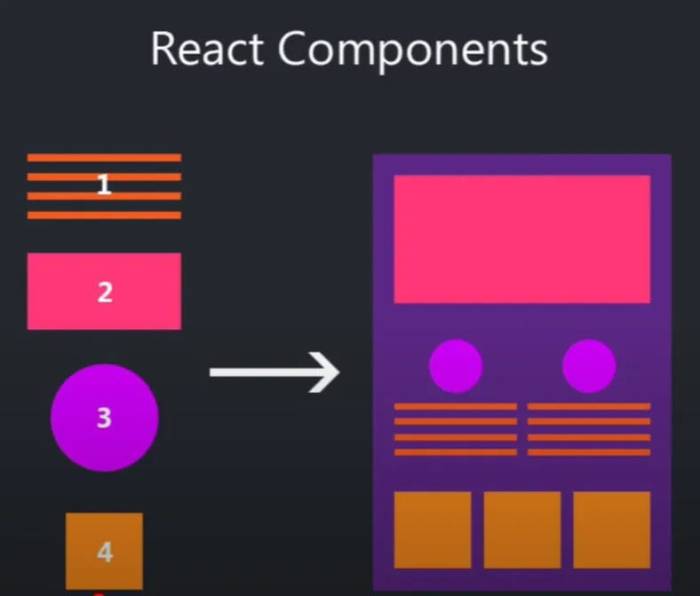
Building complex React applications without custom components is like trying to build a skyscraper with only bricks – possible, but incredibly inefficient and prone to collapse under its own weight. Custom components are the architectural blueprints that let you structure your code effectively, leading to cleaner, more maintainable, and ultimately, more successful projects. They’re the secret weapon for conquering React’s complexity and building robust, scalable applications.
Creating reusable components is a cornerstone of efficient React development. Instead of rewriting the same code snippets repeatedly for similar UI elements, you build a single, customizable component that can be used across your entire application. This not only saves you time and effort but also ensures consistency in design and functionality. Imagine having a single, perfectly crafted button component that you can use anywhere, easily changing its color, text, and functionality with simple parameters – that’s the power of reusable components. Furthermore, maintaining a project built with reusable components is significantly easier. If you need to update the styling or functionality of a specific UI element, you only need to make changes in one place, the custom component, instead of hunting down and modifying numerous instances scattered throughout your codebase.
Component Reusability and Maintainability
Component reusability significantly reduces code duplication. By encapsulating common UI elements or logic into reusable components, developers avoid writing the same code multiple times. This leads to smaller codebases, which are easier to understand, debug, and maintain. Consider a scenario where you need a specific type of form element, like a date picker. Instead of coding it multiple times, you build a reusable `DatePicker` component. Every time you need a date picker, you simply import and use the `DatePicker` component, reducing redundancy and improving consistency. Maintainability is also dramatically improved. If a bug is found in a reusable component, fixing it in one place immediately resolves the issue across all instances of that component. This drastically reduces the time and effort required for bug fixing and overall maintenance, leading to more stable and reliable applications.
A Basic Custom Component with Props
Let’s illustrate with a simple example: a custom component displaying a greeting.
“`javascript
function Greeting(props)
return ;
“`
This `Greeting` component accepts a `name` prop and renders a personalized greeting. You can use it like this:
“`javascript
“`
This would render “Hello, World!” and “Hello, Alice!” respectively, demonstrating how props allow for dynamic customization of the component’s output. The beauty lies in the simplicity: a single component, adaptable to various contexts. This simple example demonstrates the fundamental principle of passing data (props) into a component to control its behavior and output. The use of props allows for the dynamic customization of components without modifying their core functionality. This promotes reusability and keeps the code clean and maintainable.
Defining Custom Components

Source: morioh.com
So, you’ve grasped the basics of React components. Now, let’s dive into the exciting world of creating your own reusable components – the building blocks of any robust React application. Building custom components is like having your own set of LEGO bricks, allowing you to construct complex UIs with ease and maintainability. This unlocks a level of efficiency and code organization that’s essential for larger projects.
Creating custom components in React boils down to two primary approaches: functional components and class components. While both achieve the same goal, they differ significantly in their syntax, state management, and lifecycle methods. Understanding these differences is key to choosing the right approach for your specific needs.
Mastering React.js means building reusable components, boosting efficiency. Think of it like building a financial safety net for your app; just as securing your family’s future requires careful planning, check out this essential guide on The Role of Insurance in Protecting Your Family’s Financial Future to understand long-term stability. Then, get back to crafting those slick, custom React components – because a solid foundation makes for a killer app.
Functional vs. Class Components, How to Create Custom Components in React.js
The choice between functional and class components often depends on project complexity and personal preference. However, with the introduction of Hooks, functional components have become increasingly popular due to their simplicity and readability.
| Component Type | Syntax | State Management | Lifecycle Methods |
|---|---|---|---|
| Functional Component | A simple JavaScript function that returns JSX. | Uses Hooks (useState, useReducer, etc.) | No built-in lifecycle methods; uses Hooks for side effects. |
| Class Component | A JavaScript class that extends React.Component. | Uses this.state. | Uses lifecycle methods like componentDidMount, componentDidUpdate, componentWillUnmount, etc. |
Creating a Custom Component: Functional Approach
Let’s build a simple button component using a functional component. Functional components are concise and easy to understand, especially when using Hooks to manage state.
Here’s an example of a functional component that toggles a counter:
const MyButton = () =>

  const [count, setCount] = useState(0);
return (
);
;
This code uses the useState Hook to manage the counter’s state. The onClick handler updates the state, causing the component to re-render with the updated count. This approach is clean, efficient, and leverages the power of React Hooks.
Creating a Custom Component: Class Approach
Now, let’s create the same button component using a class component. This approach is more verbose but offers direct access to lifecycle methods.
class MyButtonClass extends React.Component

  constructor(props)

    super(props);

    this.state =  count: 0 ;
handleClick = () =>
this.setState( count: this.state.count + 1 );
;
render()
return (
);
This class component uses this.state to manage the counter’s state and this.handleClick to update it. While functional components often feel more modern and concise, understanding class components is still valuable, especially when working with legacy code or needing finer control over the component’s lifecycle.
Hooks in Functional Components
React Hooks are functions that let you “hook into” React state and lifecycle features from within functional components. This is a game-changer, allowing functional components to manage state and side effects without the need for classes. The most commonly used Hooks are useState for managing state and useEffect for performing side effects (like fetching data or setting up subscriptions).
useState provides a simple way to manage state within functional components. It takes an initial state value as an argument and returns an array containing the current state value and a function to update it. useEffect allows you to run side effects after a component renders. It takes a function as an argument and optionally an array of dependencies. This ensures that the effect only runs when those dependencies change.
Props and Component Communication: How To Create Custom Components In React.js
Passing data efficiently between different parts of your React application is crucial for building dynamic and reusable components. This is where props come in – they’re the mechanism React uses to allow parent components to pass data down to their children. Think of props as carefully-wrapped gifts sent from one component to another, containing everything the receiving component needs to do its job.
Props are simply JavaScript objects that a component receives as input. They’re read-only; you can’t modify them directly within the child component. This immutability helps keep your application’s state predictable and easier to debug. Let’s dive into how you can use them.
Prop Types
Different data types can be passed as props. Understanding these variations is key to building robust and predictable components. Using the correct prop type also helps catch errors early in the development process, preventing unexpected behavior at runtime.
- String: Represents text. Example:
<MyComponent name="Alice" />Here, “Alice” is a string prop. - Number: Represents numerical values. Example:
<MyComponent age=30 />. Here, 30 is a number prop. - Boolean: Represents true/false values. Example:
<MyComponent isLoggedIn=true />. Here,trueis a boolean prop, controlling conditional rendering. - Array: Represents an ordered list of values. Example:
<MyComponent hobbies=["reading", "coding", "hiking"] />. The hobbies are passed as an array. - Object: Represents a collection of key-value pairs. Example:
<MyComponent user= name: "Bob", age: 25 />. The user data is an object prop. - Function: Allows passing functions as props, enabling callback functionality. Example:
<MyComponent onButtonClick=handleClick />.handleClickis a function that’s executed when a button is clicked withinMyComponent.
Prop Drilling and Mitigation Strategies
Imagine a scenario where you have a deeply nested component structure. Data needs to travel from a top-level component down through several layers to reach the component that needs it. This is known as “prop drilling,” and it leads to messy code and makes maintenance a nightmare. The parent component passes the data to its child, which passes it to its child, and so on. It becomes unwieldy and difficult to trace data flow.
For example, consider an e-commerce application. User authentication data (like username and cart information) might need to be accessible throughout the application. Passing this data down through multiple levels via props can quickly become convoluted.
One effective solution to avoid prop drilling is to leverage the React Context API. The Context API provides a way to pass data down the component tree without explicitly passing it as props at every level. It creates a global context where components can access data without needing to be directly connected through prop chains. This makes data management more centralized and easier to maintain, especially in larger applications. Using Context, the authentication data could be made available to any component within the application’s context, without the need for repetitive prop passing.
State Management in Custom Components
So, you’ve mastered the art of creating custom React components – congrats! But the real magic happens when you start managing data within them. State management is the heart of dynamic user interfaces, allowing your components to react to user interactions and update accordingly. Let’s dive into how to handle state effectively in your custom creations.
Essentially, state management involves storing and updating data that affects the component’s rendering. Changes to the state trigger a re-render, updating the UI to reflect those changes. React offers several ways to manage this, each with its own strengths and weaknesses depending on the complexity of your application.
useState Hook in Functional Components
The useState hook is the simplest way to manage state within functional components. It’s a declarative approach, meaning you describe the state and React handles the updates. You declare a state variable and a function to update it. For instance, consider a counter component:
import React,  useState  from 'react';

function Counter()
  const [count, setCount] = useState(0);

  return (
    <div>
      <p>You clicked count times</p>
      <button onClick=() => setCount(count + 1)>
        Click me
      </button>
    </div>
  );


export default Counter;
Here, useState(0) initializes the count state to 0. The setCount function updates the state, causing a re-render. The simplicity of useState makes it perfect for managing small pieces of state within individual components.
this.state in Class Components
In class components, state is managed using the this.state object. This object holds key-value pairs representing the component’s state. Updates are done using this.setState(), which merges the provided update with the existing state. This approach is more verbose than using hooks but provides more control over state updates. Here’s a class-based counter example:
import React from 'react';

class Counter extends React.Component
  constructor(props)
    super(props);
    this.state =  count: 0 ;


  handleClick = () =>
    this.setState( count: this.state.count + 1 );
  ;

  render()
    return (
      <div>
        <p>You clicked this.state.count times</p>
        <button onClick=this.handleClick>Click me</button>
      </div>
    );


export default Counter;
Note the use of constructor to initialize state and this.setState to update it. The handleClick method is bound to the component’s instance using the arrow function syntax.
Comparison of State Management Approaches
Choosing the right state management approach depends on your project’s scale and complexity. Let’s compare some popular methods:
The choice between useState/useReducer, this.state, Context API, and Redux depends heavily on the application’s size and complexity. For small to medium-sized applications, hooks often suffice. For larger applications with complex state interactions, a more robust solution like Redux might be necessary.
- useState/useReducer vs. this.state:
useStateanduseReduceroffer a more concise and readable approach compared tothis.statein class components. They’re preferred for functional components, whilethis.stateis only relevant for class components (which are less common in modern React development). - Context API vs. Redux: The Context API is a built-in React feature for sharing state across components. It’s simpler than Redux but can become less manageable in large applications with many components needing access to the same state. Redux provides a more structured and predictable way to manage complex state, but introduces more boilerplate code. Redux is often favored for larger, more complex applications requiring efficient state management across multiple components.
Handling Events in Custom Components
So, you’ve mastered building custom React components – congrats! But a component that just sits there, pretty as a picture, isn’t very useful. To make your components interactive and dynamic, you need to handle events. This is where the magic happens – turning static displays into responsive, user-driven experiences. Let’s dive into how to capture and react to user interactions within your custom components.
Event handling in React is all about using JavaScript functions to respond to user actions. Think clicks, key presses, form submissions – these are all events that trigger specific actions within your application. By attaching event handlers to your components, you can control what happens when these events occur, making your applications truly interactive. We’ll cover the most common event types and how to use them effectively.
onClick Events
The `onClick` event is probably the most frequently used event handler. It’s triggered when a user clicks on an element. Imagine a button that needs to update some data or navigate to a different page. This is where `onClick` shines. You attach a function to the `onClick` property of the element, and that function will execute when the user clicks.
For example, consider a simple button component:
“`javascript
function MyButton(props)
return (
);
“`
This component takes a `buttonText` prop for the text displayed on the button and an `onClickHandler` prop for the function to execute on click. When used, you’d pass in a function to handle the click:
“`javascript
“`
This would display a simple alert box when the button is clicked. More complex actions can be performed within the `onClickHandler` function, such as updating component state or making API calls.
onChange Events
The `onChange` event is crucial for handling input changes in forms. Whenever the value of an input field (like a text box, select dropdown, or textarea) changes, the `onChange` event is fired. This allows you to capture the updated value and react accordingly.
Let’s look at an example with a text input:
“`javascript
function MyTextInput(props)
return (
);
“`
Here, the `onChangeHandler` function will receive an event object containing the updated value of the input field. You can then use this value to update your component’s state or perform other actions.
onSubmit Events
The `onSubmit` event is used to handle form submissions. When a user submits a form, the `onSubmit` event is triggered on the `
);
“`
This example prevents the default page reload and logs the name entered in the input field to the console. In a real application, you’d likely send this data to a server using a fetch request or similar method.
Creating a Form Component that Handles User Input and Submits Data
Let’s build a slightly more sophisticated form component that collects user name and email, then displays a confirmation message upon submission.
“`javascript
function UserRegistrationForm()
const [name, setName] = useState(”);
const [email, setEmail] = useState(”);
const [submitted, setSubmitted] = useState(false);
const handleSubmit = (event) =>
event.preventDefault();
setSubmitted(true);
;
return (
);
“`
This component uses React’s `useState` hook to manage the form data and a submission flag. The `handleSubmit` function prevents the default form submission and updates the `submitted` state. The conditional rendering of the confirmation message (`submitted && …`) ensures it only appears after submission. This showcases how to combine `onChange` and `onSubmit` for a complete form handling experience.
Styling Custom Components
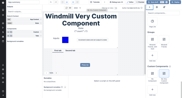
Source: windmill.dev
So, you’ve mastered the art of building custom React components – congrats! But let’s be honest, a component without some serious style is like a pizza without cheese: technically edible, but severely lacking. This section dives into the different ways you can inject some visual flair into your creations, making them look as good as they function. We’ll explore three popular methods: inline styles, CSS modules, and styled-components, comparing their strengths and weaknesses along the way. Get ready to level up your component game!
Styling in React offers a range of approaches, each with its own trade-offs. Choosing the right method depends on your project’s complexity and your personal preference. Let’s break down the options.
Inline Styles
Inline styles involve directly applying CSS properties as JavaScript objects within your component’s JSX. This approach is quick and easy for simple styling needs, but it quickly becomes unwieldy for larger projects. Imagine trying to manage hundreds of styles this way—a coding nightmare awaits!
Advantages: Simple, quick for small-scale styling. Disadvantages: Difficult to maintain and scale, not ideal for complex styles, and doesn’t offer CSS preprocessor support.
Example:
const MyComponent = () => (
);
CSS Modules
CSS Modules offer a more structured approach. They encapsulate CSS within individual files, preventing naming conflicts and promoting better organization. Each class name is scoped to its module, meaning you don’t have to worry about unintentionally overriding styles in other parts of your application. Think of it as compartmentalizing your styles for better management.
Advantages: Encapsulation prevents naming conflicts, easier to maintain than inline styles, allows for CSS preprocessor usage. Disadvantages: Requires additional configuration, can be slightly more verbose than inline styles.
Example (assuming you have a file named `Button.module.css` with the styles):
import styles from './Button.module.css';
const MyComponent = () => (
);
Styled-Components
Styled-components leverage tagged template literals to write actual CSS within your JavaScript components. This provides the benefits of CSS-in-JS, offering dynamic styling and component-level styling. It’s a powerful option for complex projects and large teams, allowing for reusable styles and better maintainability.
Advantages: CSS-in-JS, dynamic styling, excellent for complex projects, promotes reusability. Disadvantages: Steeper learning curve compared to other methods, might add some overhead.
Example:
import styled from 'styled-components';
const Button = styled.button`
background-color: blue;
color: white;
padding: 10px;
`;
const MyComponent = () => ;
Custom Button Component with Different Styling Options
Let’s create a custom button component using both CSS Modules and styled-components to demonstrate the differences. This showcases how you can easily switch between styling approaches based on your needs.
Using CSS Modules:
// Button.module.css

.primary

  background-color: blue;

  color: white;

  padding: 10px;
.secondary
background-color: green;
color: white;
padding: 10px;
// Button.js

import styles from './Button.module.css';
const Button = ( variant, children ) => (
);
export default Button;
Using styled-components:
// Button.js

import styled from 'styled-components';
const Button = styled.button`
padding: 10px;
$props => props.variant === 'primary' && `
background-color: blue;
color: white;
`
$props => props.variant === 'secondary' && `
background-color: green;
color: white;
`
`;
export default Button;
Advanced Custom Component Techniques
Level up your React game by mastering advanced techniques for crafting reusable and efficient components. We’ll explore Higher-Order Components (HOCs) and render props, two powerful patterns that unlock new levels of component flexibility and reusability. We’ll also dive into building common reusable component patterns to streamline your development workflow.
Higher-Order Components (HOCs)
Higher-Order Components are functions that take a component as an argument and return a new enhanced component. This allows you to add functionality to existing components without modifying their core logic. Think of it as a wrapper that adds extra capabilities. HOCs are particularly useful for cross-cutting concerns like logging, authentication, or data fetching.
For example, imagine you need to add authentication to several components. Instead of repeating the authentication logic in each component, you can create an HOC that handles authentication and wraps your components. This HOC would check for authentication status and either render the wrapped component or redirect to a login page. This promotes code reusability and maintainability. A simple example (conceptual) might look like this:
“`javascript
const withAuthentication = (WrappedComponent) =>
return class extends React.Component
render()
if (isAuthenticated())
return
else
return
;
;
“`
Render Props
Render props provide a flexible alternative to HOCs. Instead of returning a new component, a component using a render prop accepts a function as a prop. This function is then called by the component, allowing the parent component to determine how the child component renders its output. This gives you fine-grained control over the rendering process.
Let’s say you’re building a data fetching component. A render prop allows the parent component to dictate how the fetched data is displayed, even if the data changes. This is more flexible than HOCs because the rendering logic is entirely controlled by the parent component.
“`javascript
const DataFetcher = ( url, render ) =>
const [data, setData] = useState(null);
useEffect(() =>
fetch(url)
.then(res => res.json())
.then(data => setData(data));
, [url]);
if (!data) return
Loading…
;
return render(data);
;
// Usage:
-
data.map(item =>
- item.name
)
) />
“`
Reusable Component Patterns
Creating reusable components for common UI elements is key to efficient development. Let’s look at examples for forms, modals, and data grids.
Building these patterns involves abstracting common functionalities and allowing for customization through props. For instance, a form component might accept an array of input fields as props, while a modal component could accept content and a close button callback. A data grid component might take data, column definitions, and sorting/filtering options as props. This promotes consistency and reduces repetitive coding across your application. Each component is designed to handle its specific functionality, leaving customization to the parent component. This results in cleaner, more maintainable code.
Testing Custom Components
Building robust and reliable React applications hinges on thorough testing. Neglecting this crucial step can lead to unexpected bugs and a frustrating development experience. Testing your custom components ensures they behave as expected, preventing issues down the line and making future maintenance significantly easier. Think of it as a safety net for your code – catching potential problems before they reach your users.
Testing custom components involves verifying that individual parts (unit testing) and the interactions between these parts (integration testing) function correctly. This systematic approach guarantees a higher quality application, reduces debugging time, and improves overall developer confidence. Let’s delve into the different approaches.
Unit Tests
Unit tests focus on isolating individual components and verifying their functionality in isolation. This means testing each component independently, without considering its interaction with other parts of the application. We want to ensure that each component correctly receives and processes props, updates its internal state, and renders the expected output. Using a testing framework like Jest and React Testing Library allows us to simulate user interactions and inspect the component’s behavior.
For example, let’s say we have a simple button component:
“`javascript
// Button.js
import React from ‘react’;
const Button = ( onClick, label ) =>
return ;
;
export default Button;
“`
A unit test for this component using Jest and React Testing Library might look like this:
“`javascript
// Button.test.js
import render, fireEvent from ‘@testing-library/react’;
import Button from ‘./Button’;
test(‘Button component renders correctly’, () =>
const getByText = render();
expect(getByText(‘Click me’)).toBeInTheDocument();
);
test(‘Button onClick function is called’, () =>
const mockOnClick = jest.fn();
const getByText = render();
fireEvent.click(getByText(‘Click me’));
expect(mockOnClick).toHaveBeenCalledTimes(1);
);
“`
This test suite verifies two things: first, that the button renders the correct label; second, that the provided `onClick` function is called when the button is clicked. This is a simple example, but the principles extend to more complex components. Remember, the goal is to test individual pieces of functionality in isolation.
Integration Tests
While unit tests focus on individual components, integration tests check how multiple components work together. This is crucial because even if individual components function correctly, their interactions might lead to unexpected behavior. Integration tests help us identify such issues early in the development process.
Consider a scenario where our `Button` component interacts with a `Counter` component: clicking the button increments the counter’s value. An integration test would verify this interaction: the button’s click event correctly triggers the counter’s update mechanism.
These tests typically involve rendering multiple components and simulating interactions between them. This often requires more complex setups compared to unit tests, but the value in identifying integration-level problems far outweighs the added complexity.
Creating a Complex Custom Component
Let’s ditch the simple button components and dive into building something more substantial. Creating complex custom components in React is all about breaking down a large task into smaller, manageable pieces. This allows for better code organization, reusability, and easier debugging – all crucial for maintaining a healthy codebase as your application grows. We’ll illustrate this by building a sortable table component.
Sortable Table Component Implementation
Our sortable table will accept data as a prop and allow users to sort the table by clicking on column headers. The core logic involves managing the current sort column and direction (ascending or descending). We’ll achieve this using React’s state management capabilities and a custom sorting function. The component will be divided into three main parts: a `TableHeader` component for the sortable headers, a `TableBody` component for displaying the data rows, and the main `SortableTable` component which orchestrates the data and interactions.
TableHeader Component
This component renders the table header row. Each header cell will be a clickable element that triggers a sorting action. The styling will indicate the current sort column and direction (e.g., an upward or downward arrow). The `TableHeader` component will receive the column names as props and will call a callback function (passed down from the parent `SortableTable` component) to update the sorting state when a header is clicked. For instance, a click on the “Name” column might trigger a sorting function to order the table rows alphabetically by the “Name” field. The callback function would also need to receive the column name to know which column to sort.
TableBody Component
The `TableBody` component is responsible for rendering the actual table data rows. It will receive the sorted data as a prop and iterate over it to create a row for each data item. Each row will contain cells corresponding to the columns defined in the header. The component will simply display the data; the sorting logic resides in the parent component. The data itself will likely be an array of objects, where each object represents a row in the table. For example, a row might be represented as ` name: “John Doe”, age: 30, city: “New York” `.
SortableTable Component: Orchestration and State Management
This component acts as the container for `TableHeader` and `TableBody`. It manages the application state, including the current sort column and direction. It will pass down the necessary props to its child components. This includes the data, column names, and a callback function to handle sort column changes. The state update function will handle sorting the data based on the selected column and direction. A simple sorting algorithm like bubble sort or a more efficient one like merge sort can be implemented here. The algorithm will be chosen based on the anticipated size of the data. For smaller datasets, a simple algorithm suffices, while larger datasets benefit from more efficient algorithms. For very large datasets, exploring client-side pagination or server-side sorting would be prudent.
Example Data and Sorting Logic
Let’s assume our data is an array of objects like this: `const data = [ name: “Alice”, age: 25 , name: “Bob”, age: 30 , name: “Charlie”, age: 28 ]`. When the user clicks on the “Name” header, the `SortableTable` component updates its state to indicate sorting by “name” in ascending order. The `TableBody` then re-renders using the sorted data. The sorting function would compare the `name` property of each object alphabetically. If the user clicks the “Name” header again, the sort order would reverse to descending. This functionality demonstrates the interaction between the parent component managing state and its children displaying the data.
Final Summary
Source: medium.com
Building custom React components isn’t just about writing code; it’s about crafting elegant solutions. By mastering the concepts Artikeld here—from functional components and hooks to advanced techniques like HOCs and render props—you’ll not only improve your code quality but also unlock a whole new level of efficiency and creativity in your React projects. So go forth, build amazing components, and watch your React applications soar!


