Introduction to Data Visualization with Python: Dive into the vibrant world of data storytelling! Forget boring spreadsheets; we’re unlocking the power of Python to transform raw numbers into compelling visuals. From simple bar charts to interactive 3D masterpieces, we’ll explore the art and science of making data sing. Get ready to visualize your way to data enlightenment!
This guide takes you on a journey from setting up your Python environment and mastering data cleaning with Pandas, to crafting stunning visualizations with Matplotlib and Seaborn. We’ll even touch upon the magic of interactive charts with libraries like Plotly and Bokeh, showing you how to choose the *perfect* visualization for any dataset and audience. Prepare to see data in a whole new light.
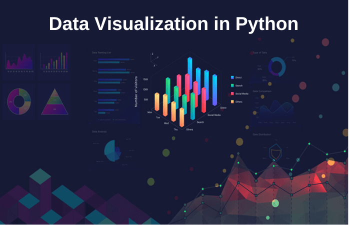
Introduction to Data Visualization
Data visualization is like giving your data a voice. Instead of staring at endless spreadsheets or rows of numbers, you transform raw information into compelling visuals that reveal hidden patterns, trends, and insights. It’s the art and science of communicating complex information clearly and effectively, making data accessible and understandable to a wider audience, regardless of their technical expertise. Think of it as translating the language of numbers into a language everyone can speak.
The Importance of Data Visualization in Understanding Data
Effective data visualization is crucial for several reasons. First, it allows for quick identification of patterns and trends that might be missed when analyzing raw data alone. Imagine trying to spot a sales surge across different regions by only looking at sales figures in a spreadsheet – it’s tedious and error-prone. A well-crafted chart, however, instantly highlights the regions experiencing growth. Second, data visualization enhances understanding and communication. Visuals make complex data more digestible, fostering better collaboration and decision-making within teams. Finally, it helps to identify outliers and anomalies – those unexpected data points that often signal potential problems or opportunities. These benefits extend across various fields, from business and finance to science and healthcare.
Types of Data Visualizations
Different types of visualizations are suited to different types of data and analytical goals. Choosing the right visualization is key to effective communication.
| Visualization Type | Uses | Strengths | Weaknesses |
|---|---|---|---|
| Bar Chart | Comparing categories, showing frequencies or proportions. For example, comparing sales figures across different product lines. | Easy to understand, effective for comparing discrete values. | Can become cluttered with many categories, not ideal for showing trends over time. |
| Scatter Plot | Exploring relationships between two continuous variables. For instance, visualizing the correlation between advertising spend and sales revenue. | Reveals correlations, identifies clusters and outliers. | Can be difficult to interpret with many data points, doesn’t directly show causality. |
| Histogram | Showing the distribution of a single continuous variable. For example, visualizing the distribution of customer ages. | Provides a clear picture of data distribution, helps identify skewness and modality. | Can be sensitive to bin size choices, doesn’t show individual data points. |
| Line Chart | Showing trends over time. For example, tracking website traffic over several months. | Excellent for visualizing change over time, easily shows patterns and trends. | Can be difficult to compare multiple lines if they are too close together. Not suitable for comparing categories. |
Benefits of Using Python for Data Visualization
Python offers a powerful and versatile ecosystem for data visualization, primarily due to its rich libraries. Libraries like Matplotlib, Seaborn, and Plotly provide a wide array of tools to create static, interactive, and even animated visualizations. Python’s flexibility allows for customization and fine-tuning of visualizations to precisely meet specific needs. Moreover, its integration with other data science tools and libraries simplifies the entire data analysis workflow. This combination of power, flexibility, and ease of integration makes Python an ideal choice for anyone working with data visualization.
Setting up Your Python Environment
Data visualization in Python is a breeze, but only if your environment is properly set up. Think of it like prepping your kitchen before baking a cake – you wouldn’t start without the right ingredients and tools, would you? Getting your Python environment right ensures a smooth and efficient data visualization journey, free from frustrating errors and dependency conflicts. This section will guide you through the essential steps.
Setting up your Python environment involves installing the necessary libraries and creating a virtual environment to keep your projects organized and prevent conflicts between different projects’ dependencies. We’ll cover both these crucial steps, along with best practices for managing your Python packages.
Installing Necessary Python Libraries
Before diving into creating stunning visualizations, you need the right tools. The core libraries for data visualization in Python are Matplotlib, Seaborn, and Pandas. Matplotlib provides the foundational plotting capabilities, Seaborn builds on Matplotlib to offer a higher-level interface with statistically informative plots, and Pandas provides the data manipulation tools to prepare your data for visualization. Other libraries, like NumPy (for numerical computation) and Scikit-learn (for machine learning tasks that might involve visualization), might also be useful depending on your project’s scope.
Installing these libraries is straightforward using pip, the Python package installer. Open your terminal or command prompt and use the following commands:
pip install matplotlib seaborn pandas numpy scikit-learn
This single command installs all five libraries. If you encounter permission errors, you might need to use sudo (on Linux/macOS) before the command or run your terminal as an administrator (on Windows). Always check for updates regularly using pip list --outdated and update them with pip install --upgrade , replacing `
Creating a Virtual Environment
Imagine trying to bake multiple cakes simultaneously using the same mixing bowls and ingredients. Chaos, right? Similarly, mixing different project dependencies in a single Python environment can lead to conflicts and headaches. This is where virtual environments shine. They create isolated spaces for each project, ensuring that each project has its own set of dependencies without interfering with others.
Creating a virtual environment is easy using the venv module (built into Python 3.3+). Navigate to your project directory in the terminal and execute:
python3 -m venv .venv
This creates a virtual environment named “.venv” in your current directory. Activate the environment using:
source .venv/bin/activate(Linux/macOS).venv\Scripts\activate(Windows)
Your terminal prompt will now indicate that the virtual environment is active. Install your project’s dependencies within this activated environment. When you’re finished, deactivate it using deactivate. This keeps your projects nicely separated and avoids dependency clashes.
Managing Python Packages and Dependencies
Maintaining a clean and well-organized set of packages is vital for reproducible and maintainable projects. Using a requirements file (typically named `requirements.txt`) is a best practice. This file lists all the packages and their versions needed for your project. You can generate it using:
pip freeze > requirements.txt
This command lists all installed packages and their versions in the `requirements.txt` file. To recreate your environment later, simply run:
pip install -r requirements.txt
This ensures that everyone working on the project, or you on a different machine, can easily set up the exact same environment. This reproducibility is crucial for collaborative projects and ensuring consistent results. Regularly updating your `requirements.txt` file is also key to keeping track of changes in your project’s dependencies.
Importing and Cleaning Data with Pandas
Source: datacamp.com
Mastering data visualization with Python unlocks powerful insights, helping you understand trends and make informed decisions. This is especially crucial when significant business changes occur, prompting a need to reassess your risk profile – check out this article on Why You Should Review Your Business Insurance After Major Changes to see how data can inform this process.
Then, use your newfound Python skills to visualize the impact of those changes on your bottom line.
Pandas is your secret weapon in the world of data visualization. It’s the Python library that allows you to effortlessly import, manipulate, and prepare your data for stunning visualizations. Think of it as your data pre-processing superhero, making the messy stuff manageable and the beautiful stuff shine. Without a clean dataset, your visualizations will be as messy as a toddler’s playroom—and nobody wants that.
Data cleaning is the often-overlooked but absolutely crucial step before any visualization. It involves identifying and addressing inconsistencies, errors, and missing pieces in your data. This ensures your visualizations accurately reflect the story your data is trying to tell. Without this stage, your conclusions could be completely skewed, leading to inaccurate interpretations and, well, bad visualizations.
Importing Data from Various Sources
Pandas provides straightforward functions for importing data from various sources. This means you’re not limited to just one file type. You can bring in your data from CSV files, Excel spreadsheets, or even directly from databases. The flexibility makes Pandas incredibly versatile for almost any data visualization project.
- CSV Files: The `read_csv()` function is your go-to for importing comma-separated value files. It handles the common scenario of data organized in rows and columns, separated by commas. For example:
data = pd.read_csv('my_data.csv')imports data from a file named ‘my_data.csv’ into a Pandas DataFrame called ‘data’. - Excel Files: For Excel spreadsheets (.xls or .xlsx), use `read_excel()`. Specify the sheet name if your data isn’t on the first sheet:
data = pd.read_excel('my_data.xlsx', sheet_name='Sheet2')imports data from ‘Sheet2’ within ‘my_data.xlsx’. - Databases: Connecting to databases requires a bit more setup, depending on the database type (SQL, NoSQL, etc.). However, Pandas integrates well with various database connectors, allowing you to query and import data directly. For instance, you might use libraries like `SQLAlchemy` to interact with SQL databases and then use Pandas to work with the resulting data.
Handling Missing Values
Missing data is a common problem in real-world datasets. Pandas offers several ways to deal with this, preventing incomplete or misleading visualizations.
- Identifying Missing Values: Pandas uses `isnull()` to identify missing values (represented as NaN – Not a Number).
missing_values = data.isnull().sum()counts the number of missing values in each column. - Removing Rows with Missing Values: The `dropna()` function removes rows containing any missing values.
data_cleaned = data.dropna()creates a new DataFrame without rows with missing data. This is simple but can lead to significant data loss if missing values are prevalent. - Imputation: Imputation replaces missing values with estimated values. Common methods include filling with the mean, median, or a more sophisticated technique like K-Nearest Neighbors (KNN). For example:
data['column_name'].fillna(data['column_name'].mean(), inplace=True)fills missing values in ‘column_name’ with the column’s mean.
Handling Outliers
Outliers are data points that significantly differ from the rest of the data. They can distort visualizations and mislead analyses.
- Identifying Outliers: Box plots are visually helpful for identifying outliers. Statistical methods like the Interquartile Range (IQR) can also be used to define outlier thresholds.
Q1 = data['column_name'].quantile(0.25)andQ3 = data['column_name'].quantile(0.75)calculate the first and third quartiles, respectively. The IQR is thenIQR = Q3 - Q1. Values belowQ1 - 1.5 * IQRor aboveQ3 + 1.5 * IQRare often considered outliers. - Removing Outliers: Removing outliers is a straightforward approach but should be done cautiously. It’s crucial to understand why outliers exist before removing them.
filtered_data = data[(data['column_name'] >= Q1 - 1.5 * IQR) & (data['column_name'] <= Q3 + 1.5 * IQR)]filters the data to remove outliers based on the IQR method. - Transforming Outliers: Instead of removing outliers, you can transform them. Log transformations or other data transformations can sometimes reduce the impact of outliers without losing valuable data points.
Data Transformation with Pandas
Pandas offers a rich set of functions for transforming data to suit your visualization needs.
- Creating New Columns: You can easily create new columns based on existing ones. For example:
data['new_column'] = data['column1'] + data['column2']creates a new column 'new_column' by adding values from 'column1' and 'column2'. - Applying Functions: The `apply()` method lets you apply custom functions to columns or rows. For example, you could apply a function to standardize values or create categorical variables.
data['column_name'] = data['column_name'].apply(lambda x: x2)squares each value in 'column_name'. - Data Aggregation: Pandas provides powerful aggregation functions like `groupby()` for summarizing data.
grouped = data.groupby('category_column')['numeric_column'].mean()calculates the mean of 'numeric_column' for each category in 'category_column'.
Creating Basic Visualizations with Matplotlib
Matplotlib is the cornerstone of data visualization in Python. It's a powerful library offering a wide range of plotting capabilities, from simple bar charts to complex 3D visualizations. This section will focus on creating the fundamental chart types – bar charts, line graphs, and scatter plots – and customizing their appearance to effectively communicate your data insights. We'll cover the essential syntax and demonstrate how to add titles, labels, and legends to enhance clarity and understanding.
Matplotlib provides a straightforward interface for creating visualizations. Its object-oriented approach allows for fine-grained control over every aspect of your plots. By mastering the basics presented here, you'll lay a solid foundation for more advanced data visualization techniques.
Bar Charts with Matplotlib
Bar charts are excellent for comparing categorical data. Matplotlib's bar() function makes creating them a breeze. You simply provide the x-axis categories and the corresponding y-axis values. Adding error bars, changing colors, and adjusting the width are all easily achievable through additional parameters. For instance, to create a bar chart showing the sales of different products (Product A, Product B, Product C) with sales figures (100, 150, 80), the code would look something like this:
import matplotlib.pyplot as plt

products = ['Product A', 'Product B', 'Product C']

sales = [100, 150, 80]

plt.bar(products, sales)

plt.xlabel('Products')

plt.ylabel('Sales')

plt.title('Product Sales')

plt.show()
This code will generate a simple bar chart with product names on the x-axis and sales figures on the y-axis. Further customization, like adding color or changing bar width, can be easily incorporated.
Line Graphs with Matplotlib
Line graphs are ideal for showing trends over time or continuous data. Matplotlib's plot() function is the workhorse here. Similar to bar charts, you provide x and y values, and Matplotlib connects the points to create a line. Multiple lines can be plotted on the same graph to compare different trends. Consider visualizing website traffic over a month. Daily website visits could be represented on the y-axis and days of the month on the x-axis. A simple line graph effectively illustrates the traffic trend. The code might look like this:
import matplotlib.pyplot as plt

days = range(1, 32)

visits = [100, 110, 120, 105, 115, 130, 140, 135, 125, 110, 100, 90, 80, 90, 100, 110, 120, 130, 140, 150, 145, 135, 120, 110, 100, 95, 105, 115, 125, 130, 120]

plt.plot(days, visits)

plt.xlabel('Day of Month')

plt.ylabel('Website Visits')

plt.title('Website Traffic')

plt.show()
This generates a line graph showcasing website traffic fluctuations over the month.
Scatter Plots with Matplotlib
Scatter plots are useful for visualizing the relationship between two variables. Matplotlib's scatter() function creates these plots. Each point represents a data point, with its x and y coordinates determined by the two variables. For example, visualizing the relationship between ice cream sales and temperature. Temperature is on the x-axis and ice cream sales on the y-axis. A positive correlation would be expected – higher temperatures generally lead to higher ice cream sales. The code for this could be:
import matplotlib.pyplot as plt

temperature = [20, 22, 25, 28, 30, 32, 35, 38, 40, 42]

sales = [100, 110, 130, 150, 170, 190, 200, 220, 240, 260]

plt.scatter(temperature, sales)

plt.xlabel('Temperature (°C)')

plt.ylabel('Ice Cream Sales')

plt.title('Ice Cream Sales vs. Temperature')

plt.show()
This creates a scatter plot showing the relationship between temperature and ice cream sales.
Comparison of Matplotlib Functions
The following table summarizes the syntax and functionalities of the Matplotlib functions used for creating basic charts.
| Chart Type | Function | Key Parameters | Description |
|---|---|---|---|
| Bar Chart | plt.bar() |
x, height, width, color, label |
Creates a bar chart to compare categorical data. |
| Line Graph | plt.plot() |
x, y, color, label, linewidth |
Creates a line graph to show trends over time or continuous data. |
| Scatter Plot | plt.scatter() |
x, y, color, size, label |
Creates a scatter plot to visualize the relationship between two variables. |
Advanced Visualization Techniques with Seaborn
Source: githubusercontent.com
Seaborn, built on top of Matplotlib, elevates your data visualization game to a whole new level. It offers a higher-level interface, streamlining the creation of statistically informative and visually appealing plots. Forget wrestling with Matplotlib's intricate details; Seaborn simplifies the process, allowing you to focus on the insights hidden within your data. This section dives into some of Seaborn's most powerful features, showing you how to create sophisticated visualizations and unlock deeper understandings of your datasets.
Seaborn's strength lies in its ability to seamlessly integrate statistical estimation and visualization. Unlike Matplotlib, which primarily focuses on plotting, Seaborn automatically handles many aspects of statistical representation, creating richer and more insightful graphics. This makes it ideal for exploratory data analysis and communicating statistical findings effectively. We'll explore this difference through practical examples, comparing and contrasting the approaches of both libraries.
Heatmaps for Correlation Analysis
Heatmaps are a fantastic way to visualize correlation matrices, instantly revealing relationships between multiple variables. Imagine analyzing customer purchasing behavior across various product categories. A heatmap would clearly display which products are frequently purchased together, providing valuable insights for targeted marketing campaigns. Seaborn's `heatmap` function effortlessly generates these visualizations, automatically handling color scaling and labeling. For example, a heatmap displaying strong positive correlation between "toothpaste" and "toothbrushes" would be represented by a bright, saturated color in the corresponding cell of the matrix, indicating a high likelihood of joint purchase. Conversely, a pale color would represent weak or no correlation. The intuitive color scheme makes it easy to identify strong and weak relationships at a glance. Compared to Matplotlib, which requires more manual configuration to achieve the same result, Seaborn significantly simplifies the process.
Box Plots for Data Distribution Comparison, Introduction to Data Visualization with Python
Box plots are powerful tools for comparing the distribution of a numerical variable across different categories. Let's consider analyzing employee salaries across different departments within a company. A box plot would immediately reveal the median salary, quartiles, and outliers for each department, facilitating a clear comparison of salary distributions. Seaborn's `boxplot` function simplifies the creation of these plots, automatically calculating and displaying the key statistical measures. This contrasts with Matplotlib, where you would need to manually calculate these statistics and plot them individually. Seaborn's automated approach not only saves time but also minimizes the risk of errors in manual calculations, leading to more reliable and accurate visualizations. Outliers, represented as individual points beyond the whiskers of the box plot, are easily identified, highlighting potential anomalies or unusual data points that might warrant further investigation.
Seaborn's Statistical Estimation Capabilities
Seaborn excels at providing statistical context to your visualizations. Many of its functions automatically compute and display confidence intervals, regression lines, and other statistical summaries. This allows for a deeper understanding of the data beyond just the raw values. For instance, when plotting a scatter plot with a regression line using Seaborn, the line not only shows the trend but also implicitly conveys the strength and direction of the relationship, providing a more complete picture than a simple scatter plot generated using Matplotlib. This automatic inclusion of statistical information significantly enhances the interpretative value of the visualizations, making them more suitable for communicating findings to both technical and non-technical audiences. Seaborn's ability to integrate statistical estimations directly into the visualization process sets it apart from Matplotlib and makes it an invaluable tool for data exploration and analysis.
Interactive Visualizations

Source: geeksforgeeks.org
Static visualizations are great for getting a general overview of your data, but sometimes you need more. Interactive visualizations allow you to explore your data in a dynamic way, uncovering hidden patterns and insights that static charts simply can't reveal. Think of it like the difference between looking at a map and using Google Earth – one provides a snapshot, the other lets you zoom, pan, and explore in detail. This increased interactivity significantly boosts understanding and data exploration.
Interactive visualizations offer a richer, more engaging way to communicate your findings. By allowing users to directly manipulate the visualization, you empower them to discover insights at their own pace. This is especially crucial when presenting data to a non-technical audience or when dealing with complex datasets. We'll explore how to leverage the power of Python libraries like Plotly and Bokeh to create these dynamic data stories.
Plotly and Bokeh: Tools for Interactive Visualization
Plotly and Bokeh are two powerful Python libraries that provide the tools to create interactive charts. Plotly is known for its ease of use and wide range of chart types, while Bokeh excels in creating interactive dashboards and visualizations for large datasets. Both libraries offer features like tooltips (hover information), zooming, panning, and other interactive elements that enhance data exploration. Choosing between them often depends on the specific needs of your project; Plotly is a great all-arounder, while Bokeh shines when dealing with more complex interactive scenarios.
Creating Interactive Charts with Tooltips and Zooming
Let's see how to add interactivity to your visualizations. Below are examples demonstrating the creation of interactive charts using Plotly. The steps are straightforward and easily adaptable to other libraries and chart types.
Here's how to create a simple interactive scatter plot with Plotly, including tooltips and zooming:
- Import necessary libraries:
import plotly.express as px - Prepare your data: Assume you have a Pandas DataFrame called
dfwith columns 'x', 'y', and 'label'. - Create the interactive scatter plot:
fig = px.scatter(df, x="x", y="y", color="label", hover_data=['label']) - Customize the layout (optional): You can add titles, axis labels, and other customizations using
fig.update_layout(...). - Show the plot:
fig.show()
This code snippet will generate a scatter plot where hovering over each point displays the 'label' information (tooltip). Zooming and panning are enabled by default.
Interactive Visualization of Global Temperature Data
Let's illustrate the power of interactive visualizations with a real-world example. We'll use a dataset containing global average temperatures over time. This dataset might be sourced from NOAA or similar climate data repositories. The goal is to create an interactive line chart that allows users to explore temperature trends over different time periods.
Imagine a line chart showing global average temperatures from 1880 to 2023. The chart would be interactive, allowing users to zoom in on specific decades to examine temperature changes in more detail. Tooltips would display the exact temperature for each year when the cursor hovers over the line. This visualization would allow for a more thorough analysis of climate change trends, compared to a static chart which would only offer a broad overview. Users can easily identify periods of rapid warming or cooling, and pinpoint significant climate events through interactive exploration.
The insights gained from this interactive visualization would be significantly richer than those obtained from a static chart. Users could identify periods of accelerated warming, potentially correlating these periods with specific events or policy changes. The ability to zoom and explore specific time ranges would enable a much deeper understanding of the historical context of climate change.
Choosing the Right Visualization
Data visualization isn't just about making pretty pictures; it's about effectively communicating insights from your data. Choosing the wrong chart type can obscure your message, leading to misinterpretations and missed opportunities. This section will guide you through selecting the optimal visualization for your data and analytical goals, ensuring your message resonates with your audience.
Selecting the appropriate visualization hinges on understanding both your data and your objectives. Different chart types excel at highlighting different aspects of data. A bar chart might be perfect for comparing categories, while a scatter plot reveals correlations. Considering your audience's familiarity with various chart types is also crucial for clear communication. Finally, the context in which the visualization will be used – a formal presentation, a quick data exploration, or a dashboard – influences the best choice.
Data Types and Appropriate Visualizations
The type of data you're working with significantly impacts the visualization you should choose. Categorical data, representing groups or labels (e.g., colors of cars), benefits from charts like bar charts, pie charts, or treemaps. Numerical data, representing quantities (e.g., car prices), is best displayed using histograms, scatter plots, line charts, or box plots. For visualizing relationships between variables, scatter plots and heatmaps are excellent choices. Consider the following examples:
- Categorical Data: A bar chart clearly shows the distribution of car colors, with each bar representing a color and its height representing the number of cars of that color. A pie chart could also work, illustrating the proportion of each color.
- Numerical Data: A histogram effectively displays the distribution of car prices, showing the frequency of cars within specific price ranges. A box plot summarizes the distribution, showing the median, quartiles, and outliers.
- Relationships between Variables: A scatter plot shows the relationship between car price and mileage, with each point representing a car. A positive correlation would indicate that higher mileage is associated with lower prices.
Best Practices for Effective Data Visualization
Effective data visualization prioritizes clarity, accuracy, and relevance. Avoid cluttering charts with unnecessary details. Use clear and concise labels, choose an appropriate color palette, and ensure the chart's scale is accurate and easy to interpret. The goal is to make the data's story immediately understandable, regardless of the audience's statistical expertise. For example, a chart showing sales trends should clearly label the axes, use a consistent scale, and avoid distracting background elements.
Choosing the Right Visualization: A Decision Tree
Making the right visualization choice can be simplified using a decision tree. This process guides you through a series of questions, leading to the most appropriate chart type for your data and purpose.
- What is the primary goal of your visualization?
- Compare categories: Bar chart, Pie chart, Treemap
- Show distribution: Histogram, Box plot, Violin plot
- Reveal trends over time: Line chart, Area chart
- Show relationships between variables: Scatter plot, Heatmap
- Display geographic data: Map
- What type of data are you visualizing?
- Categorical: Bar chart, Pie chart, Treemap
- Numerical: Histogram, Box plot, Scatter plot, Line chart
- Both categorical and numerical: Grouped bar chart, Box plot (grouped)
- What is the size of your dataset?
- Small: Most chart types are suitable
- Large: Consider using techniques to reduce data complexity or interactive visualizations.
- Who is your audience?
- Technical audience: More complex charts might be appropriate
- Non-technical audience: Prioritize simplicity and clarity
Data Visualization Best Practices
Data visualization isn't just about creating pretty pictures; it's about effectively communicating insights from your data. A well-designed visualization makes complex information easily understandable, while a poorly designed one can mislead or confuse your audience. This section dives into the key principles for creating visualizations that are clear, accurate, and aesthetically pleasing.
Effective data visualization hinges on three core principles: clarity, accuracy, and aesthetics. Clarity ensures your message is easily understood at a glance. Accuracy demands that your visuals faithfully represent the data without distortion or manipulation. Aesthetics enhance the visual appeal, making the information more engaging and memorable. Ignoring any of these aspects can significantly diminish the impact of your visualization.
Clarity in Data Visualization
Clarity is paramount. A cluttered or confusing chart defeats the purpose of visualization. Think of it like this: your visualization should tell a story, and a muddled narrative is no story at all. Key elements for achieving clarity include concise labeling of axes and data points, a clear title that summarizes the key finding, and a thoughtful choice of chart type that best suits your data and message. Avoid unnecessary visual clutter like excessive gridlines or distracting colors. A simple, clean design is far more effective than a visually overwhelming one. For instance, a bar chart clearly showing sales figures across different regions is far clearer than a pie chart attempting to display the same data with numerous, similarly sized segments.
Accuracy in Data Visualization
Accuracy is non-negotiable. Distorting data to support a particular narrative is unethical and undermines the credibility of your work. Ensure your data is correctly represented, and avoid techniques like truncating axes or using misleading scales that exaggerate or downplay differences. Always consider potential biases in your data collection and analysis, and transparently address them in your visualizations. A classic example of inaccurate visualization is manipulating the y-axis scale to make a small change appear significant. Imagine a line graph showing a slight increase in sales; stretching the y-axis makes the increase appear dramatic, when in reality it’s minimal.
Aesthetics in Data Visualization
While clarity and accuracy are paramount, aesthetics play a crucial role in engagement. A visually appealing visualization is more likely to capture and hold your audience's attention. This doesn't mean using flashy animations or overly complex designs; rather, it involves using a consistent color palette, appropriate fonts, and a well-organized layout. Think about using whitespace effectively to avoid visual clutter and guide the viewer's eye. A well-chosen color scheme can enhance understanding; for example, using a consistent color to represent a specific category across multiple charts makes comparisons easier. Conversely, a jarring or inconsistent color scheme can make the visualization difficult to interpret.
Wrap-Up: Introduction To Data Visualization With Python
So, you've unlocked the secrets of data visualization with Python! You're now equipped to transform complex datasets into clear, concise, and captivating visuals. Remember, the key is choosing the right chart for your story, and Python provides the tools to tell it beautifully. Go forth and visualize the world!
