A Beginner’s Guide to Web Design Principles: Dive into the captivating world of web design, where aesthetics meet functionality. We’ll unravel the core concepts, from understanding user experience (UX) and visual design principles to mastering layout, content strategy, and accessibility. Get ready to transform your digital dreams into reality!
This guide navigates you through the essential elements of crafting engaging and effective websites. We’ll explore the historical context of web design, showcase examples of both brilliant and disastrous designs, and arm you with practical techniques to create websites that are not only visually stunning but also user-friendly and accessible to everyone. Prepare for a journey that blends theory with practical application, leaving you equipped to embark on your web design adventures.
Introduction to Web Design Principles
So, you want to build a website? Awesome! But before you dive headfirst into coding, you need to understand the fundamental principles of web design. Think of it like building a house – you wouldn’t start laying bricks without a blueprint, right? Web design principles are your blueprint, ensuring your website is not only visually appealing but also user-friendly and effective. This guide will give you the basics to get started.
Web design is more than just making things look pretty. It’s about creating a seamless and enjoyable experience for your users. It’s about strategically using visual elements, typography, and functionality to achieve specific goals, whether that’s selling products, sharing information, or building a community.
A Brief History of Web Design Evolution
The early days of the web were…well, let’s just say they weren’t pretty. Think flashing GIFs, blinking text, and those annoying under-construction pages that seemed to linger forever. The focus was primarily on functionality, with aesthetics taking a backseat. The evolution saw a shift towards cleaner designs, influenced by the rise of CSS and better understanding of user experience (UX). The introduction of responsive design, allowing websites to adapt to different screen sizes, marked another major milestone. Today, web design is a constantly evolving field, driven by advancements in technology and user expectations. Think minimalist aesthetics, micro-interactions, and the increasing importance of mobile-first design.
Examples of Good and Bad Web Design
Let’s look at some real-world examples. A well-designed website, like Apple’s, is characterized by its clean layout, intuitive navigation, and high-quality visuals. Everything feels intentional and user-focused. On the other hand, a poorly designed website might be cluttered, difficult to navigate, and visually unappealing. Imagine a site with flashing banners, mismatched fonts, and an overwhelming amount of information – that’s a recipe for user frustration. The key difference lies in the thoughtful application of design principles.
A Simple Visual Representation of the Design Process
Imagine a flowchart. It starts with defining the purpose and target audience of the website. This leads to the creation of wireframes, basic skeletal layouts. Next comes the visual design phase, where you choose colors, fonts, and imagery. Then, the website is built, followed by rigorous testing and refinement based on user feedback. This iterative process ensures a final product that’s both visually appealing and effective. The entire process is cyclical; feedback from users often leads to improvements and iterations of the design. This continuous feedback loop is vital for long-term success.
Understanding User Experience (UX)
User experience (UX) is the backbone of any successful website. It’s not just about making a website look pretty; it’s about crafting a seamless and enjoyable experience for your users, from the moment they land on your page to the moment they leave (hopefully, with a purchase or a feeling of satisfaction!). A well-designed UX leads to increased user engagement, higher conversion rates, and ultimately, a more successful online presence. Ignoring UX is like building a house without a foundation – it might look impressive initially, but it won’t stand the test of time.
UX design focuses on understanding user needs and behaviors to create a website that is intuitive, efficient, and enjoyable to use. This involves a deep dive into user research, careful planning, and iterative testing to ensure the website meets user expectations and solves their problems effectively.
User Research Methods for Web Design
Effective user research is crucial for understanding your target audience and their needs. Several methods can be employed to gather valuable insights. These methods provide data-driven decisions, ensuring the website caters to the actual needs and behaviors of its users. This prevents costly mistakes and ensures the website’s success.
- User Interviews: In-depth conversations with potential users to uncover their motivations, frustrations, and expectations regarding websites like yours.
- Surveys: Gathering quantitative and qualitative data from a larger sample size through questionnaires, allowing for broad insights into user preferences and behaviors.
- A/B Testing: Comparing two versions of a website element (e.g., button color, layout) to determine which performs better in terms of user engagement and conversion.
- Usability Testing: Observing users as they interact with your website to identify pain points and areas for improvement. This often involves recording user sessions and analyzing their actions and feedback.
- Card Sorting: A method used to understand how users categorize information on a website. Users are given cards with website content and asked to group them into categories that make sense to them.
Creating User Personas
User personas are fictional representations of your ideal users. They are based on research and data gathered through the methods mentioned above. Creating detailed personas helps designers to empathize with their target audience and make informed design decisions. Each persona should have a name, background, goals, frustrations, and technological proficiency. For example, a persona for an online clothing retailer might be “Sarah, a 28-year-old working professional who values convenience and stylish clothing but is short on time.” Having these well-defined personas ensures that design choices cater to specific user needs and behaviors.
Key Elements of User-Centered Design
User-centered design prioritizes the needs and expectations of the user throughout the entire design process. Several key elements contribute to a successful user-centered design approach. These elements ensure that the website is intuitive, accessible, and enjoyable to use. They lead to a positive user experience and increased website effectiveness.
- Accessibility: Designing the website to be usable by people with disabilities, adhering to accessibility guidelines like WCAG.
- Intuitive Navigation: Creating a clear and easy-to-understand website structure that allows users to find what they need quickly and efficiently.
- Clear Call to Actions (CTAs): Guiding users towards desired actions with prominent and well-designed buttons and prompts.
- Visual Hierarchy: Using visual cues like size, color, and placement to guide the user’s eye and emphasize important information.
- Consistent Branding: Maintaining a consistent brand identity throughout the website to create a cohesive and professional experience.
Illustrating the User Journey on a Website
Imagine a user wanting to purchase a book from an online bookstore. The user journey can be represented as a flowchart:
[Descriptive Flowchart] The flowchart would begin with the user arriving at the homepage. Arrows would then illustrate the user navigating to the search bar, entering their search query, browsing the search results, selecting a book, adding it to their cart, proceeding to checkout, filling in their shipping and payment information, confirming the order, and finally receiving an order confirmation. Each step would be represented by a box in the flowchart, showing the progression of the user’s interaction with the website. Potential branching paths, like abandoning the cart or encountering an error, could also be included to provide a more complete picture of the user’s experience.
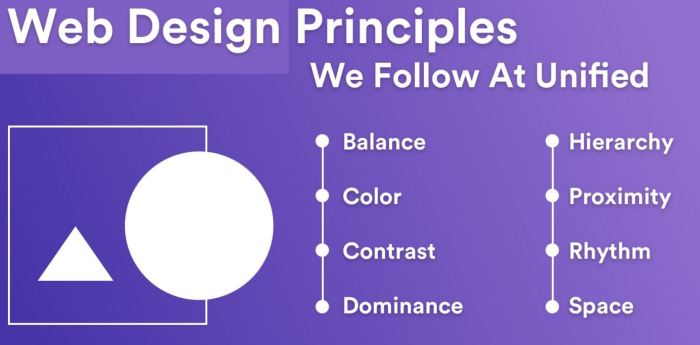
Visual Design Principles
Crafting a visually appealing website isn’t just about aesthetics; it’s about guiding the user seamlessly through your content. Effective visual design hinges on several key principles that work together to create a harmonious and user-friendly experience. These principles aren’t arbitrary rules; they’re rooted in how our brains process visual information. Understanding them is crucial for building websites that are both beautiful and functional.
Visual Hierarchy
Visual hierarchy dictates the order in which the eye scans a webpage. It’s about strategically arranging elements to emphasize key information and guide the user’s attention. Think of it as creating a visual roadmap through your content. By prioritizing certain elements, you control the narrative and ensure users understand the most important information first. This is achieved through size, color, contrast, and positioning. A well-defined visual hierarchy prevents a cluttered, confusing design and makes the website easy to navigate. For example, a prominent headline in a larger, bolder font immediately grabs attention, while supporting text uses a smaller, less prominent font.
Color Palette Selection
The colors you choose significantly impact the mood and feel of your website. A well-chosen palette evokes emotion, builds brand identity, and enhances readability. Consider using color psychology – for instance, blues often convey calmness, while reds stimulate excitement. Effective color palettes often use a combination of dominant, secondary, and accent colors. The dominant color sets the overall tone, while secondary colors provide support, and accent colors highlight key elements. A good example would be a website for a yoga studio using calming blues and greens as the dominant colors, accented with a warm orange for call-to-action buttons. Avoid using too many colors, as this can overwhelm the user and detract from the overall design.
Typography Best Practices
Typography goes beyond simply choosing a font; it’s about selecting fonts that are legible, consistent, and enhance the overall design. The choice of font impacts readability, brand identity, and the overall aesthetic. Using too many different fonts can create visual chaos. Stick to a maximum of two or three fonts – one for headings, one for body text, and perhaps one for accents. Ensure sufficient contrast between the text color and the background color to improve readability. Consider the font size and line height (leading) to ensure comfortable reading. For example, a clean sans-serif font like Open Sans for body text paired with a more distinctive serif font like Merriweather for headings provides a balanced and readable combination.
Whitespace Utilization
Whitespace, the empty space around elements on a webpage, is often overlooked but incredibly important. It’s not just about filling the void; it provides visual breathing room, improves readability, and helps organize content. Adequate whitespace prevents a cluttered and overwhelming design, allowing elements to stand out and improve the overall user experience. It also creates a sense of calm and professionalism. Think of whitespace as the negative space that allows the positive elements to shine. Websites that overuse images and text without sufficient whitespace often feel cramped and difficult to navigate.
Sample Webpage Design
| Headline | Supporting Text | Image | Call to Action |
|---|---|---|---|
Welcome to Our Website! |
This is a sample webpage demonstrating good visual hierarchy. Notice the use of different font sizes and colors to emphasize key elements. |
Imagine a captivating image here, perhaps a product photo or landscape, that complements the overall design and adds visual interest. |
Layout and Structure
Building a website isn’t just about pretty pictures; it’s about creating a user-friendly experience. A well-structured website is intuitive and easy to navigate, guiding visitors effortlessly towards their goals. This section delves into the crucial aspects of website layout and structure, ensuring your online presence is as effective as it is aesthetically pleasing.
Website layout dictates how content is arranged on the page, impacting readability and user experience. Two common approaches are grid layouts and fluid layouts. Grid layouts use a system of rows and columns to organize content, creating a structured and visually appealing arrangement. This is particularly useful for maintaining consistency across different pages. Fluid layouts, on the other hand, adapt to the size of the user’s screen, ensuring the website looks good on desktops, tablets, and smartphones. The choice between these depends on the specific needs of the website and its content.
Responsive Design Principles
Responsive design ensures a website adapts seamlessly to various screen sizes and devices. This isn’t just about making the text smaller; it’s about reorganizing content, adjusting images, and optimizing the overall layout for optimal viewing on any device. A responsive website uses flexible grids, flexible images, and CSS media queries to achieve this adaptability. For example, a website designed for a desktop might display three columns of products. On a mobile phone, this could be reorganized into a single, scrollable column. This ensures a consistent and enjoyable user experience regardless of the device used.
Navigation and Information Architecture
Effective navigation is paramount for user experience. It’s the roadmap guiding visitors through your website. Information architecture is the underlying structure of the website’s content, determining how information is organized and presented. A well-structured information architecture makes it easy for users to find what they’re looking for, improving user satisfaction and reducing bounce rates. Poor navigation, on the other hand, can lead to frustration and lost conversions.
Common Website Navigation Patterns
Several established navigation patterns guide users effectively through a website. Choosing the right pattern depends on the website’s complexity and content.
- Mega Menu: A large dropdown menu offering extensive categorization and sub-navigation options, suitable for websites with extensive content.
- Top Navigation Bar: A horizontal bar at the top of the page containing primary navigation links. This is a classic and widely used pattern.
- Side Navigation Bar: A vertical bar on the left or right side of the page, often used for supplementary navigation or filtering.
- Breadcrumbs: A trail of links showing the user’s current location within the website’s hierarchy. This improves orientation and allows users to easily navigate back to higher levels.
- Footer Navigation: Navigation links placed at the bottom of the page, often including legal information and sitemap links.
Wireframe for a Simple E-commerce Website
A wireframe is a low-fidelity visual representation of a website’s layout and structure. It helps in planning the organization of content and elements before designing the visual aspects. Below is a description of a wireframe for a simple e-commerce website.
Imagine a rectangular screen. At the top, a horizontal navigation bar displays “Home,” “Shop,” “About Us,” and “Contact.” Below this, a large banner image occupies the majority of the upper half, showcasing featured products or promotions. The lower half is divided into two columns. The left column displays product categories with thumbnails, while the right column showcases featured products with brief descriptions and “Add to Cart” buttons. The footer contains copyright information, social media links, and contact details.
Content Strategy: A Beginner’s Guide To Web Design Principles
Crafting compelling website content isn’t just about throwing words onto a page; it’s the cornerstone of a successful online presence. A well-defined content strategy ensures your website speaks directly to your target audience, driving engagement and achieving your business goals. It’s about understanding what your visitors want and providing it in a clear, concise, and engaging way.
Clear and Concise Website Copy
Clear and concise website copy is crucial for user experience. Rambling sentences and jargon confuse visitors and drive them away. Instead, focus on using short, impactful sentences and simple language that everyone can understand. Think of it like this: your website copy should be easy to scan and digest, even for someone skimming the page. Every word should serve a purpose, guiding the user towards your desired outcome. Imagine trying to read a novel on a small screen – it’s exhausting! Your website should be the opposite: a refreshing breath of fresh air in the overwhelming digital world.
Effective Calls to Action (CTAs)
Calls to action are the prompts that encourage visitors to take the next step. They’re the “buttons” that lead users to convert – whether that’s making a purchase, signing up for a newsletter, or contacting your business. Effective CTAs are clear, concise, and visually appealing. Examples include: “Shop Now,” “Learn More,” “Get a Free Quote,” or “Sign Up Today.” The key is to make the CTA relevant to the content and easy to find. A poorly placed or unclear CTA is like a hidden treasure – nobody will find it! Think about the placement, button design, and wording – they should all work together seamlessly.
Best Practices for Optimizing Website Content for Readability
Readability is key to keeping visitors engaged. Use short paragraphs, bullet points, headings, and subheadings to break up large blocks of text. Incorporate visuals, such as images and videos, to make the content more appealing and easier to digest. Ensure your website is mobile-friendly, as many users access websites through their smartphones. Finally, use a legible font size and style that is easy on the eyes. Remember, you’re not writing a dissertation; you’re crafting an experience.
The Role of Content Marketing in Web Design
Content marketing is the strategic process of creating and distributing valuable, relevant, and consistent content to attract and retain a clearly defined audience — and, ultimately, to drive profitable customer action. It’s about building relationships with your audience by providing them with helpful and engaging content. This could include blog posts, infographics, videos, and social media updates. Content marketing helps to establish your brand as a thought leader in your industry and drives organic traffic to your website. It’s a long-term strategy that pays off in increased brand awareness and customer loyalty. Think of it as a conversation, not a sales pitch.
Sample Landing Page Copy
Let’s say we’re designing a landing page for a new productivity app called “FlowState.”
“Unlock Your Productivity with FlowState. Get things done faster and smarter with our intuitive app. Download your free trial today!”
Below this headline, we’d have concise bullet points highlighting key features:
* Streamlined task management
* Customizable dashboards
* Seamless cloud synchronization
* Intuitive user interface
Then, a strong CTA: “Download Your Free Trial Now!” with a prominent button. The entire page should be clean, visually appealing, and easy to navigate. The copy is focused, avoiding jargon and technical details, and speaks directly to the user’s need for increased productivity.
Accessibility and Inclusivity
Source: slidesharecdn.com
So you’re diving into our Beginner’s Guide to Web Design Principles? Awesome! Building a killer online presence is crucial, but remember, a strong website needs more than just aesthetics; it needs legal protection. That’s where understanding insurance comes in, like learning about how to How to Protect Your Business from Legal Claims with Insurance can safeguard your digital empire.
Once you’ve got the legal side covered, you can truly focus on mastering those web design fundamentals.
Building a website isn’t just about aesthetics; it’s about making it usable and enjoyable for everyone. Accessibility and inclusivity are crucial for ensuring your website reaches its full potential and welcomes a diverse audience. A website that’s inaccessible excludes a significant portion of potential users, limiting your reach and impact. Let’s dive into what makes a website truly accessible and inclusive.
WCAG Guidelines and Implementation
The Web Content Accessibility Guidelines (WCAG) are the gold standard for web accessibility. These guidelines, developed by the World Wide Web Consortium (W3C), provide a comprehensive set of recommendations for creating accessible web content. WCAG 2.1, the current version, organizes accessibility into four principles: Perceivable, Operable, Understandable, and Robust (POUR). Implementing WCAG involves careful consideration of various aspects of web design, from using appropriate alt text for images to ensuring sufficient color contrast. For instance, ensuring sufficient color contrast between text and background is a key aspect of WCAG compliance, making the text readable for people with visual impairments. Following WCAG guidelines isn’t just about checking boxes; it’s about designing with empathy and considering the needs of all users.
Techniques for Creating Inclusive Web Designs
Creating inclusive web designs goes beyond simply meeting WCAG standards; it’s about proactively considering the diverse needs and preferences of your users. This includes using clear and concise language, avoiding jargon, and providing multiple ways to interact with your website. For example, offering keyboard navigation as well as mouse interaction is crucial for users with motor impairments. Similarly, providing captions and transcripts for videos ensures accessibility for deaf and hard-of-hearing users. Careful consideration of font choices, ensuring readability at different screen sizes and resolutions, and offering alternative text formats (like plain text) are also essential aspects of inclusive design. The goal is to create a user experience that is welcoming, engaging, and usable for everyone.
Examples of Accessible Design Elements
Let’s look at some concrete examples of accessible design. Using descriptive alt text for images, not just “image1.jpg,” but rather “A smiling woman holding a laptop” allows screen readers to convey the image’s content. Providing clear headings and logical page structure using appropriate HTML heading tags (H1-H6) helps users navigate the website easily, particularly those using assistive technologies. Furthermore, ensuring sufficient color contrast between text and background, such as using dark text on a light background or vice versa, improves readability for users with visual impairments. Interactive elements should be clearly labeled and identifiable using ARIA attributes (Accessible Rich Internet Applications) to help assistive technologies understand their purpose.
Tools and Resources for Web Accessibility Testing
Thorough testing is crucial to ensure your website meets accessibility standards. Several tools and resources are available to help you in this process.
- WAVE Web Accessibility Evaluation Tool: A browser extension that highlights accessibility issues on a webpage.
- Accessibility Insights for Web: A tool from Microsoft that provides automated accessibility testing and recommendations.
- Lighthouse (Chrome DevTools): Offers an accessibility audit as part of its broader web performance analysis.
- aXe (Deque): A powerful accessibility testing tool with both browser extensions and API options.
- WCAG 2.1 Checklist: Provides a detailed checklist to help you manually verify compliance with WCAG guidelines.
Using these tools and following WCAG guidelines is a crucial step towards creating a truly accessible and inclusive website.
Images and Multimedia

Source: com.au
In the digital realm, a picture truly is worth a thousand words. High-quality visuals are crucial for creating a website that’s not only functional but also engaging and memorable. Think about it: would you rather spend time on a website filled with blurry, pixelated images, or one that boasts crisp, vibrant visuals? The answer is pretty clear. This section dives into the world of images and multimedia, showing you how to use them effectively to boost your website’s appeal and performance.
High-Quality Images: The Foundation of Visual Appeal
Using high-resolution images significantly impacts user experience. Low-resolution images appear blurry and unprofessional, detracting from the overall credibility of your website. High-quality images, on the other hand, showcase your brand’s professionalism and attention to detail. They enhance the visual appeal, making your website more attractive and engaging for visitors. Consider the difference between a grainy product photo and a sharp, well-lit one – the latter instantly communicates higher quality and trust. Invest time in sourcing or creating high-quality images; it’s an investment that pays off in spades.
Alt Text: Making Images Accessible
Alt text, or alternative text, is a short description of an image. It’s essential for accessibility, as it allows screen readers used by visually impaired individuals to “see” the image. It also improves your website’s (Search Engine Optimization) by providing context to search engines. Effective alt text accurately describes the image’s content and purpose, avoiding unnecessary s. For example, instead of “image of a cat,” a better alt text would be “Fluffy Persian cat lounging on a sunbeam.” This provides a much richer understanding of the image’s content.
Image Optimization for Web Performance
Optimizing images is crucial for website speed and performance. Large, uncompressed images can significantly slow down loading times, leading to frustrated users and lower search engine rankings. Techniques like compression (reducing file size without significant quality loss) and resizing images to appropriate dimensions are essential. Using appropriate image formats (like WebP for superior compression) also plays a vital role. Think of it like this: a fast-loading website is a happy user, and a happy user is more likely to engage with your content.
Types of Images Suitable for Websites
Several image types cater to different website needs.
Here are three examples:
- JPEG: Best for photographs and images with smooth color gradients. JPEGs offer good compression, resulting in smaller file sizes, but can cause some loss of image quality during compression. They are a widely supported format, making them a safe choice for most websites.
- PNG: Ideal for images with sharp lines, text, and logos. PNGs support lossless compression, meaning no image quality is lost during compression, making them perfect for graphics where detail is crucial. However, they generally result in larger file sizes compared to JPEGs.
- SVG: Scalable Vector Graphics are resolution-independent, meaning they can be scaled to any size without losing quality. This makes them perfect for logos and illustrations that need to be displayed at various sizes across different devices. SVGs are also smaller in file size than raster images (like JPEGs and PNGs) when representing simple graphics.
Creating a Visually Appealing Image Carousel
An image carousel is a slideshow of images, often used to showcase products, testimonials, or other visual content. To create one, you would typically use HTML to structure the carousel (defining the container and individual image elements) and CSS to style it (controlling aspects like transitions, animations, and overall appearance). JavaScript might be employed for adding interactive elements like automatic sliding or manual navigation. The key is to ensure smooth transitions and a clean, uncluttered design that doesn’t overwhelm the user. Consider using a visually consistent theme across the images to maintain a cohesive look. A well-designed carousel can significantly enhance user engagement and highlight key visuals.
Testing and Iteration
Building a website isn’t like baking a cake – you can’t just follow a recipe and expect perfection. The digital world is dynamic, and what works for one audience might completely flop with another. That’s where testing and iteration come in: the crucial final steps to transforming a good website into a great one. Think of it as continuous improvement, a cycle of building, testing, learning, and refining.
User testing is absolutely vital because it bridges the gap between your vision and the actual user experience. Without it, you’re essentially building a website in a vacuum, guessing what people want instead of knowing. Gathering feedback allows you to identify usability issues, design flaws, and areas where your website falls short of expectations, ultimately leading to a more effective and engaging online presence.
User Testing Methods
Several methods exist to gather valuable user feedback. Each method offers unique insights into different aspects of the user experience. Choosing the right method depends on your budget, timeline, and specific goals.
For example, A/B testing allows you to compare two versions of a webpage to see which performs better. You might test different button colors, headlines, or call-to-action placements to optimize conversions. Imagine testing two versions of an e-commerce product page: one with a prominent “Add to Cart” button and another with a less noticeable one. A/B testing reveals which button design leads to more purchases. Usability testing, on the other hand, involves observing users as they interact with your website, identifying pain points and areas for improvement. This might involve watching users navigate your site, completing tasks, and providing verbal feedback. Imagine watching a user struggle to find the contact information on your website – this is valuable feedback that can lead to a redesign.
Iterating Based on User Feedback
Once you’ve gathered user feedback through testing, the next step is to iterate on your design. This is an iterative process, meaning you’ll likely go through multiple rounds of testing and refinement. Don’t be afraid to make changes based on what you learn – that’s the beauty of iteration.
For instance, if usability testing reveals that users are struggling to find a specific piece of information, you might reorganize the website’s navigation or add clearer visual cues. If A/B testing shows that a certain headline leads to a higher click-through rate, you’ll want to incorporate that into your final design. Remember, iteration is a continuous process. Even after launch, you should continue to monitor website performance and make adjustments as needed.
Website Success Metrics
Measuring the success of your website requires tracking key performance indicators (KPIs). These metrics provide data-driven insights into user behavior and website effectiveness.
Common metrics include bounce rate (percentage of visitors who leave after viewing only one page), conversion rate (percentage of visitors who complete a desired action, such as making a purchase or signing up for a newsletter), average session duration (average time spent on the website), and unique visitors (number of individual users who visit the website). For example, a high bounce rate might indicate a problem with your website’s content or design, prompting a redesign of your landing page. A low conversion rate might suggest a problem with your call-to-action or overall user experience, leading to an A/B test of different approaches.
Testing and Iteration Plan for a Simple Website, A Beginner’s Guide to Web Design Principles
Let’s say you’re designing a simple portfolio website. A plan for testing and iteration might look like this:
- Phase 1: Initial Design and Usability Testing: Create a basic prototype of your portfolio website. Conduct usability testing with 5-7 participants, observing their interactions and gathering feedback on navigation, ease of finding information, and overall aesthetic appeal.
- Phase 2: Iteration Based on Feedback: Based on the feedback from Phase 1, revise the website’s design, addressing any usability issues or areas of confusion. This might involve reorganizing content, improving navigation, or refining the visual design.
- Phase 3: A/B Testing: Once the revised design is complete, conduct A/B testing on key elements, such as the headline, call-to-action, and image placement. Compare different versions to see which performs best in terms of engagement and conversion (e.g., contact form submissions).
- Phase 4: Launch and Monitoring: Launch the website and continuously monitor key performance indicators (KPIs) like bounce rate, time on site, and conversion rates. Use this data to inform further iterations and improvements.
Final Conclusion
Source: co.za
Building a killer website isn’t just about pretty pictures; it’s about understanding your users, crafting a seamless experience, and communicating your message effectively. This beginner’s guide has equipped you with the foundational knowledge to create websites that are both visually appealing and user-friendly. Now go forth and create something amazing!


