How to Build an Interactive Dashboard with JavaScript? Forget static spreadsheets; we’re diving headfirst into the electrifying world of dynamic data visualization. This isn’t your grandpappy’s dashboard – we’re talking interactive magic, powered by the awesome potential of JavaScript. Get ready to level up your data game and build dashboards that actually *do* something.
From choosing the perfect JavaScript library (React? Vue? Angular? The choices are plentiful!) to mastering data visualization techniques and crafting a responsive design that looks killer on any screen, we’ll cover every step of the process. We’ll tackle data handling, building interactive components, and even delve into the exciting world of advanced features like map integrations and data animations. By the end, you’ll be ready to build dashboards that are not only beautiful but also incredibly functional and user-friendly.
Choosing the Right JavaScript Libraries and Frameworks: How To Build An Interactive Dashboard With JavaScript
Building an interactive dashboard is like crafting a finely tuned machine – the right tools make all the difference. Choosing the wrong JavaScript library can lead to a clunky, slow, and frustrating experience. Let’s explore some top contenders and see which one fits your project’s needs.
JavaScript Library Comparison for Interactive Dashboards
Picking the perfect JavaScript library for your dashboard hinges on several factors. This table compares some popular choices, highlighting their strengths and weaknesses for creating interactive, data-rich experiences.
| Library | Strengths | Weaknesses | Best For |
|---|---|---|---|
| React | Component-based architecture for reusability, large community support, excellent performance with Virtual DOM, extensive ecosystem of third-party libraries. | Steeper learning curve compared to Vue, can be verbose for smaller projects. | Large, complex dashboards with frequent updates and a need for scalability. |
| Vue | Gentle learning curve, easy integration with existing projects, highly performant, excellent documentation. | Smaller community compared to React, fewer readily available third-party libraries compared to React. | Medium-sized dashboards, projects where ease of use and rapid development are prioritized. |
| Angular | Comprehensive framework with built-in features for routing, state management, and testing, strong TypeScript support. | Steep learning curve, can be overkill for smaller projects, larger bundle size compared to React and Vue. | Large-scale enterprise applications requiring a structured approach and robust tooling. |
| D3.js | Unmatched control over data visualization, powerful for creating highly customized and interactive charts and graphs. | Steep learning curve, requires significant coding effort, can be challenging for complex dashboards. | Data visualization-heavy dashboards requiring highly specific and custom chart designs. Not ideal for dashboards requiring many non-visualization components. |
Learning Curve and Community Support
The ease of learning and the size of the community surrounding a library significantly impact development speed and problem-solving capabilities. A larger, more active community translates to readily available resources, tutorials, and support when you encounter challenges.
| Library | Learning Curve | Community Support |
|---|---|---|
| React | Medium to High | Excellent |
| Vue | Low to Medium | Good |
| Angular | High | Good |
| D3.js | High | Good, but more specialized than other libraries. |
Factors Influencing Library Selection
Choosing a JavaScript library isn’t just about picking the “best” one; it’s about finding the best fit for your specific project. Consider these key factors:
Project Complexity: For smaller, simpler dashboards, Vue’s ease of use might be ideal. For large, complex projects demanding scalability and maintainability, React’s component-based architecture and extensive ecosystem shine. Angular is a solid choice for enterprise-level applications needing a structured approach. D3.js is best suited for highly customized visualizations, but its complexity makes it less ideal for dashboards with many non-visualization components.
Desired Features: Do you need advanced data visualization capabilities? D3.js is the king. Do you need robust routing and state management? Angular offers these out-of-the-box. If your focus is on rapid development and ease of use, Vue might be the better option. React provides a balance between performance, flexibility, and a large ecosystem.
Team Expertise: Consider your team’s existing skills and experience. Choosing a library your team is already familiar with will significantly speed up development and reduce the learning curve. If your team is new to JavaScript frameworks, Vue’s gentle learning curve might be the most effective starting point.
Development Timeline: Tight deadlines might favor libraries with simpler learning curves and readily available components, such as Vue. More complex projects with longer timelines might benefit from the scalability and robust features of React or Angular.
Data Handling and Visualization
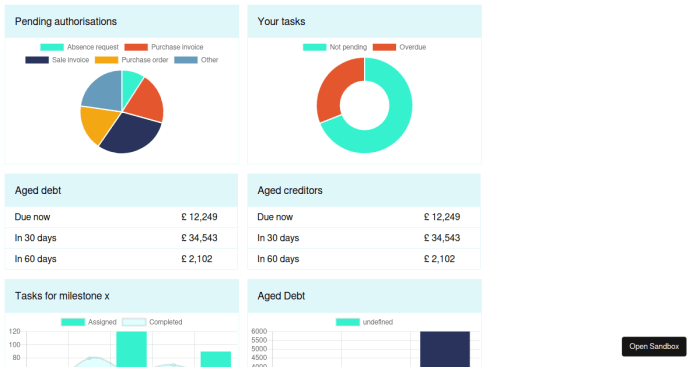
Source: codesandbox.io
Mastering JavaScript dashboards? Think dynamic visualizations showing, say, real-time weather data impacting your home. But before you get too comfy, consider adding a layer of financial security: check out this article on Why You Should Add Flood Insurance to Your Homeowners Policy to protect against unforeseen events. Then, get back to building those killer JavaScript dashboards, knowing your assets are covered.
Building an interactive dashboard isn’t just about pretty colors and flashy animations; it’s about making sense of data. This section dives into how to wrangle your data into a format JavaScript can understand and then transform it into compelling visualizations. We’ll cover different data formats, how to connect to various data sources, and finally, how to visualize your data effectively.
Data handling and visualization are crucial steps in creating effective interactive dashboards. Choosing the right approach for each stage directly impacts the overall user experience and the insights that can be derived from the data.
Data Formats and Handling in JavaScript
Interactive dashboards often work with various data formats. Let’s look at three common ones: JSON, CSV, and XML. Understanding how to parse these formats is key to making your dashboard dynamic.
JSON (JavaScript Object Notation) is a lightweight text-based format that’s easy for humans to read and write. It’s also easy for machines to parse and generate. JavaScript natively supports JSON parsing using the `JSON.parse()` method. For example, if you have a JSON string like this:
“`javascript
let jsonData = `”name”: “Hipwee”, “visitors”: 1000000`;
let dataObject = JSON.parse(jsonData);
console.log(dataObject.name); // Output: Hipwee
console.log(dataObject.visitors); // Output: 1000000
“`
CSV (Comma Separated Values) is a simple text format where values are separated by commas. JavaScript doesn’t have built-in CSV parsing, but libraries like Papa Parse make it a breeze. Papa Parse handles various delimiters and quote characters, making it robust for different CSV files.
XML (Extensible Markup Language) is a more complex, hierarchical format. JavaScript can parse XML using the DOMParser. This involves navigating the XML tree structure to extract the relevant data. While powerful, XML parsing can be more involved than JSON or CSV parsing.
Integrating with Data Sources
Connecting your dashboard to various data sources is essential for keeping it up-to-date and relevant. Let’s consider APIs, databases, and spreadsheets.
APIs (Application Programming Interfaces) provide a structured way to access data from external services. Many APIs return data in JSON format, making integration straightforward. You’ll typically use `fetch` or `XMLHttpRequest` to make requests to the API and then parse the JSON response. For example, fetching data from a weather API and displaying it on your dashboard would involve sending a request, receiving JSON data, and then using that data to update elements in your dashboard.
Databases, like SQL databases, require a database connector library to interact with. Libraries like Node.js’s `mysql` or `pg` (for PostgreSQL) allow you to execute queries and retrieve data in JSON or other formats. This data can then be processed and visualized in your dashboard.
Spreadsheets, like those in Google Sheets or Excel, can be accessed through their respective APIs. These APIs often allow you to retrieve data in formats like JSON or CSV, which you can then process and visualize within your JavaScript dashboard.
Visualizing Different Data Types
Choosing the right chart type is crucial for effective data visualization. Different chart types suit different data types.
For numerical data, bar charts are excellent for comparing values across categories, while line graphs show trends over time. Scatter plots are useful for identifying correlations between two numerical variables. Pie charts effectively represent proportions of a whole.
For categorical data, bar charts are again a great choice, showing the frequency of different categories.
For temporal data (data with a time component), line graphs are ideal for showing trends over time. You can also use bar charts to compare values across different time periods. Here’s a simple example of creating a bar chart using a JavaScript charting library like Chart.js:
“`javascript
// Sample data
const data =
labels: [‘January’, ‘February’, ‘March’],
datasets: [
label: ‘My First Dataset’,
data: [65, 59, 80],
backgroundColor: [‘rgba(255, 99, 132, 0.2)’, ‘rgba(54, 162, 235, 0.2)’, ‘rgba(255, 206, 86, 0.2)’],
borderColor: [‘rgba(255, 99, 132, 1)’, ‘rgba(54, 162, 235, 1)’, ‘rgba(255, 206, 86, 1)’],
borderWidth: 1
]
;
// Configuring Chart.js
const config =
type: ‘bar’,
data: data,
options:
;
// Creating the chart
const myChart = new Chart(
document.getElementById(‘myChart’),
config
);
“`
This code snippet assumes you have a canvas element with the id “myChart” in your HTML. Chart.js handles the rendering of the bar chart based on the provided data. Remember to include the Chart.js library in your project. Similar approaches can be used with other libraries for other chart types.
Building Interactive Components
So, you’ve got your data visualized beautifully on your dashboard. But a static dashboard is like a silent movie – it’s got potential, but it lacks that crucial element of engagement. This is where interactive components come in, transforming your dashboard from a passive display into a dynamic, user-driven experience. We’ll explore how to add those elements that make your dashboard truly sing.
Interactive components aren’t just about bells and whistles; they’re about empowering users to explore the data in a way that’s intuitive and insightful. By allowing users to filter, sort, and drill down into specific aspects of the data, you’re providing them with the tools they need to uncover meaningful patterns and make informed decisions. Think of it as giving your users a magnifying glass and a pair of tweezers to really delve into the data.
Button Interactions
Buttons are the workhorses of interactive dashboards. They provide a clear and simple way for users to trigger actions, such as filtering data based on specific criteria, downloading reports, or switching between different visualizations. For instance, a button labeled “Show 2023 Data” could filter the displayed information to only include data from the year 2023. This functionality is achieved using JavaScript event listeners. When a user clicks the button, the event listener triggers a function that updates the dashboard’s data and visualization. A simple example might involve adding a class to filter elements in the DOM, hiding those not matching the criteria. For instance, if your data is displayed in a table, you could hide rows that don’t meet the filter condition.
Slider Controls for Range Selection
Sliders offer a visual and intuitive way for users to select a range of values. Imagine a dashboard displaying sales data over time. A slider could allow users to easily select a specific time period, instantly updating the chart to show sales within that range. The slider’s value can be captured using an event listener, and this value can be used to filter the data accordingly. Consider a slider with minimum and maximum values, representing, for instance, the start and end dates of a period. The slider’s ‘change’ event can trigger a function to update the displayed data. This allows for smooth, real-time updates as the user adjusts the slider.
Dropdown Menus for Categorical Filtering
Dropdown menus are ideal for filtering data based on categorical variables. For example, a dashboard displaying customer data might have a dropdown menu allowing users to filter by region, product category, or customer segment. Each option in the dropdown corresponds to a specific filter criteria. When a user selects an option, the selected value is used to filter the data, updating the dashboard visualizations dynamically. This requires an event listener on the dropdown’s change event. The selected value can then be used to update the data displayed in the dashboard, for instance, by updating a chart’s data series or filtering a table’s rows.
Implementing Tooltips for Data Insights
Tooltips provide concise information about data points when a user hovers over them. For example, on a bar chart showing sales by region, a tooltip could display the exact sales figures for each region when the user’s mouse hovers over the corresponding bar. This enhances the user experience by providing quick access to detailed data without cluttering the main visualization. Tooltips are typically implemented using JavaScript event listeners (mouseover and mouseout events) and DOM manipulation to create and display the tooltip element. The tooltip content is dynamically generated based on the data associated with the hovered element. For example, a simple tooltip might show “Region: North, Sales: $100,000” when the mouse hovers over a bar representing the North region.
Date Pickers for Time-Series Data
Date pickers provide a user-friendly way to select specific dates or date ranges for time-series data. They’re particularly useful for dashboards displaying data that changes over time, such as stock prices, website traffic, or weather patterns. A date picker can be easily integrated into a JavaScript dashboard using a dedicated library or by creating a custom date picker from scratch. When a user selects a date or range, the selected value is used to filter the data and update the dashboard visualizations accordingly. Similar to other interactive components, event listeners are used to detect date selection changes and trigger the necessary data updates. For instance, a date picker might allow users to select a start and end date to visualize sales data within that timeframe.
Implementing Responsive Design
So, you’ve built your awesome interactive dashboard. It’s bursting with data, slick visualizations, and user-friendly controls. But…does it look equally amazing on a tiny phone screen as it does on a massive desktop monitor? If not, you’re missing out on a huge chunk of potential users. Responsive design is the key to unlocking that potential, ensuring your dashboard is accessible and enjoyable across all devices.
Creating a responsive dashboard isn’t about simply shrinking your elements; it’s about strategically adapting the layout and functionality to suit different screen sizes and user interactions. Think of it as tailoring your dashboard to fit each user’s specific context. This involves a careful consideration of layout, component arrangement, and even the data displayed to optimize the user experience across various devices.
Responsive Layout Techniques, How to Build an Interactive Dashboard with JavaScript
Designing for different screen sizes requires a flexible approach. We need to ensure that elements rearrange themselves seamlessly as the screen size changes. Common techniques include using CSS media queries to apply different styles based on screen width, viewport meta tags for proper scaling, and flexible grid systems like Bootstrap or Flexbox. For instance, a large chart might occupy the entire width on a desktop, but gracefully collapse into a smaller, scrollable view on a mobile device. Similarly, interactive elements should remain easily accessible regardless of screen size, avoiding overly small buttons or overlapping components.
Dashboard Design for Different Devices
Designing for mobile, tablet, and desktop environments necessitates different approaches. Mobile dashboards should prioritize essential information, using concise visualizations and clear navigation. Tablets allow for a more detailed view, possibly incorporating more interactive elements. Desktop dashboards can accommodate the most comprehensive display, allowing for detailed analysis and exploration of the data. Consider prioritizing the most critical information on mobile, adding layers of detail as screen real estate increases. Think of it like a Russian nesting doll—each device reveals more information as the screen size expands.
Optimizing Performance and Usability Across Resolutions
A responsive dashboard is only as good as its performance. Slow loading times or clunky interactions can ruin the user experience, regardless of the design’s elegance. Several techniques help optimize performance and usability:
Optimizing image sizes and using efficient image formats (like WebP) is crucial. Lazy loading images, which only loads images as they become visible in the viewport, significantly improves initial load times. Minimizing HTTP requests by combining CSS and JavaScript files also helps. Furthermore, employing techniques like code splitting to load only necessary JavaScript modules on demand can enhance performance, especially on lower-powered devices. Finally, regularly testing your dashboard on different devices and screen sizes is vital to identify and address any performance bottlenecks or usability issues. Think of it as a quality control process, but for your dashboard’s responsiveness. A little extra testing goes a long way in creating a truly user-friendly experience.
Advanced Features and Enhancements
Level up your JavaScript dashboard game! We’ve covered the basics, but now it’s time to explore the features that will truly make your dashboard shine and provide genuinely insightful data visualization. This section dives into integrating external libraries, enhancing interactivity, and optimizing performance for a smoother, more powerful user experience.
Integrating external libraries unlocks a world of possibilities. Think beyond simple bar charts – let’s add some serious pizzazz.
Map Visualizations and Geographical Data Handling
Integrating map visualizations significantly enhances the ability to represent geographical data effectively. Libraries like Leaflet or Mapbox GL JS provide powerful tools to create interactive maps, overlay data points, and visualize geographical patterns. For example, you could display sales data across different regions, plot the locations of your customers, or visualize the spread of a phenomenon over time. These libraries handle map projections, tile loading, and marker management, making it easier to create visually appealing and informative maps within your dashboard. Consider the potential impact of displaying sales figures on a heatmap overlaying a geographical map of your sales territories – instantly revealing high-performing and underperforming areas. This visual representation surpasses the limitations of simple tabular data.
Data Filtering and Sorting Functionalities
Giving users control over how they view data is key. Implementing robust filtering and sorting options allows users to easily explore and analyze data subsets relevant to their needs. For example, allowing users to filter sales data by product category, date range, or region enhances the dashboard’s usability and allows for deeper data exploration. Sorting options enable users to arrange data based on various criteria, such as sales volume, profit margin, or customer location, providing different perspectives on the same dataset. Imagine a dashboard displaying financial data where users can quickly filter transactions by date, type, and amount. This targeted view allows for more efficient analysis than sifting through raw data. The implementation often involves using JavaScript libraries that simplify the interaction with the data and the updating of the visualization.
Dashboard Performance Optimization
A slow dashboard is a frustrating dashboard. Optimizing performance is crucial for a positive user experience, especially when dealing with large datasets. Strategies include minimizing HTTP requests by bundling and minifying JavaScript files, leveraging browser caching, and efficiently handling data updates. Consider techniques like lazy loading, where data is loaded only when needed, reducing initial load times. Data virtualization, where only a subset of the data is loaded and processed at a time, is also invaluable for handling massive datasets. Imagine a dashboard displaying real-time stock market data – performance optimization is critical here to ensure smooth updates and prevent lag. By implementing efficient data handling techniques, you ensure a responsive and enjoyable user experience.
Deployment and Hosting
So, you’ve built your awesome interactive JavaScript dashboard. Congratulations! Now comes the exciting (and sometimes slightly nerve-wracking) part: getting it online for the world to see. Deployment and hosting might seem daunting, but with the right approach, it’s a smooth process. This section breaks down the steps and options to get your masterpiece live.
Deploying your JavaScript dashboard involves getting your code and its associated files (like images and data) onto a web server, which then makes it accessible via a web address (URL). This isn’t just about uploading files; it’s about configuring the server to correctly interpret and serve your dashboard’s JavaScript, HTML, and CSS. Think of it as the final, crucial step in making your project a reality.
Web Server Deployment Steps
Deploying to a web server generally follows these steps:
- Prepare Your Code: Before deploying, thoroughly test your dashboard locally. Ensure all dependencies are correctly managed using a package manager like npm or yarn. Minify your JavaScript and CSS files to reduce load times. Create a clean and organized project structure for easy server management.
- Choose a Hosting Provider: Select a hosting provider that meets your needs (discussed in the next section). Factors include cost, scalability, features (like databases), and technical support.
- Upload Your Files: Use FTP (File Transfer Protocol) or a similar method to upload your project files to the server’s designated directory. Your hosting provider will guide you on the specifics.
- Configure the Server: Depending on your hosting provider and the complexity of your dashboard, you might need to configure the server (e.g., setting up a virtual host, configuring Apache or Nginx). This step often involves modifying server configuration files.
- Test the Deployment: After uploading and configuring, thoroughly test your dashboard’s functionality on the live server. Check links, data loading, and interactive elements.
Hosting Options
Several hosting options exist, each with its own set of advantages and disadvantages.
- Static Site Hosting (e.g., Netlify, GitHub Pages): Ideal for dashboards with minimal server-side processing. These services are generally inexpensive and easy to use, but they may lack features for complex applications needing databases or backend logic. Think of this as perfect for simpler dashboards that primarily rely on client-side JavaScript.
- Cloud Hosting (e.g., AWS, Google Cloud, Azure): Offers scalability, reliability, and a wide range of services. These platforms are more expensive but are suitable for dashboards requiring high traffic, complex functionality, and database integration. A great choice if you anticipate your dashboard growing significantly and needing robust infrastructure.
- Shared Hosting: A cost-effective option for smaller projects, but resources are shared among multiple users, potentially impacting performance. This is suitable for basic dashboards with low traffic expectations. However, scaling can be difficult.
- VPS (Virtual Private Server): Provides more control and resources than shared hosting but requires more technical expertise. This is a good middle ground offering more control than shared hosting, but less than cloud hosting.
Securing Your Dashboard
Security is paramount. Here are some best practices:
- Use HTTPS: Always deploy your dashboard over HTTPS to encrypt data transmitted between the browser and the server. This protects user data and prevents man-in-the-middle attacks.
- Input Validation: Sanitize all user inputs to prevent cross-site scripting (XSS) and SQL injection attacks. Never trust user-supplied data.
- Regular Updates: Keep your JavaScript libraries and frameworks updated to patch security vulnerabilities.
- Strong Passwords and Authentication: If your dashboard requires user authentication, implement strong password policies and secure authentication mechanisms.
- Regular Security Audits: Conduct periodic security audits to identify and address potential vulnerabilities.
Accessibility Considerations
Building an interactive dashboard is only half the battle; making it usable for everyone is the other, equally crucial half. An accessible dashboard ensures that users with disabilities, such as visual, auditory, motor, or cognitive impairments, can effectively interact with and understand the information presented. Ignoring accessibility not only excludes a significant portion of your potential audience but also contradicts principles of inclusive design.
Creating an accessible dashboard requires a proactive approach, integrating accessibility features from the initial design phase. This isn’t about adding features after the fact; it’s about building accessibility into the core functionality and structure.
Semantic HTML
Using semantic HTML involves employing HTML tags that accurately reflect the meaning and purpose of the content. Instead of relying solely on visual styling (like using divs with CSS to create a button), use elements like `