How to Use Python Libraries for Data Analysis? Unlock the power of Python’s data science ecosystem! This guide dives deep into the essential libraries – NumPy, Pandas, and Matplotlib – showing you how to wrangle, analyze, and visualize your data like a pro. We’ll cover everything from basic installation to advanced techniques, transforming you from data novice to Python wizard.
Get ready to conquer data challenges with confidence. We’ll walk you through practical examples, step-by-step instructions, and clear explanations, ensuring you master the art of data analysis in Python. From cleaning messy datasets to creating stunning visualizations, this guide has you covered. Prepare to unlock insights hidden within your data!
Introduction to Python for Data Work
Python’s become the go-to language for data analysis, and for good reason. It’s versatile, boasts a massive community, and offers a wealth of powerful libraries that simplify complex tasks. Whether you’re crunching numbers, visualizing trends, or building predictive models, Python’s got you covered.
Python’s advantages for data manipulation stem from its readability, extensive libraries, and a supportive community providing ample resources and tutorials. This combination allows for faster development, easier code maintenance, and a broader range of analytical capabilities compared to other programming languages often used for data analysis.
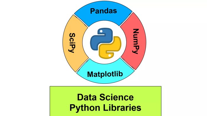
Essential Python Libraries for Data Analysis
Choosing the right tools is half the battle. Here’s a breakdown of some essential Python libraries that will significantly boost your data analysis prowess.
| Library Name | Description | Key Functions | Example Use Case |
|---|---|---|---|
| NumPy | Provides support for large, multi-dimensional arrays and matrices, along with a collection of high-level mathematical functions to operate on these arrays. | array(), reshape(), dot(), linalg.solve() |
Performing complex mathematical operations on large datasets, such as calculating correlations or performing linear algebra operations. For example, analyzing sensor data from a weather station, where each sensor reading is a data point in a multi-dimensional array. |
| Pandas | Offers high-performance, easy-to-use data structures and data analysis tools. Think of it as Excel on steroids. | DataFrame(), read_csv(), groupby(), merge() |
Cleaning and manipulating datasets, handling missing values, grouping data by categories, and performing aggregations like calculating averages or sums. Imagine analyzing sales data from a retail store, cleaning it up, and then grouping it by product category to see sales trends. |
| Matplotlib | A comprehensive library for creating static, interactive, and animated visualizations in Python. | plot(), scatter(), hist(), bar() |
Creating various types of charts and graphs to visualize data patterns. For instance, creating a bar chart showing the sales performance of different products or a scatter plot to visualize the relationship between two variables, like advertising spend and sales revenue. |
Installing Python Libraries using pip
Installing these powerful tools is surprisingly easy. The pip package manager, included with most Python installations, handles the heavy lifting. Simply open your terminal or command prompt and use the following command for each library:
pip install numpy pandas matplotlib
This command will download and install the specified libraries, along with any necessary dependencies. After installation, you can import them into your Python scripts using the import statement (e.g., import numpy as np). Make sure you have a stable internet connection during the installation process. If you encounter any issues, double-check your Python installation and internet connectivity. Online resources and community forums are readily available to troubleshoot any problems you might face.
NumPy for Numerical Computing
Source: testingdocs.com
NumPy, short for Numerical Python, is the cornerstone of almost any data science project in Python. It provides powerful tools for working with arrays and matrices, significantly speeding up numerical computations and simplifying complex mathematical operations. Think of it as the engine that drives many of the more advanced data analysis libraries. Without a solid grasp of NumPy, your data science journey will be significantly harder.
NumPy’s core strength lies in its ndarray (n-dimensional array) object. These arrays are highly efficient for storing and manipulating numerical data, allowing for vectorized operations that are far faster than traditional Python loops. This efficiency is crucial when dealing with large datasets, a common scenario in data analysis.
Array Creation and Manipulation
Creating NumPy arrays is straightforward. You can initialize them from lists, tuples, or other array-like objects. For example, creating a 1D array from a list is as simple as np.array([1, 2, 3, 4, 5]). Multi-dimensional arrays are created similarly, using nested lists. NumPy also offers functions to create arrays with specific properties, such as np.zeros() for an array filled with zeros, np.ones() for an array filled with ones, and np.arange() to create an array with a sequence of numbers. Manipulating these arrays involves slicing (extracting portions of the array), reshaping (changing the array’s dimensions), and concatenating (joining arrays together). These operations are all vectorized, meaning they operate on entire arrays at once, leading to significant performance gains.
Mathematical Operations on Arrays
NumPy provides a rich set of functions for performing mathematical operations on arrays. These include element-wise operations (adding, subtracting, multiplying, dividing arrays element by element), matrix multiplication (using np.dot() or the @ operator), and many more specialized functions like trigonometric functions, exponential functions, and logarithmic functions. These operations are all highly optimized for speed and efficiency. For instance, calculating the mean, standard deviation, or sum of an array is a single function call away (e.g., np.mean(array), np.std(array), np.sum(array)). This significantly simplifies complex calculations and makes code cleaner and more readable.
Linear Algebra Tasks
NumPy’s linear algebra capabilities are extensive, offering functions for matrix inversion, eigenvalue and eigenvector calculations, solving systems of linear equations, and more. These functions are crucial for many data analysis tasks, such as dimensionality reduction, regression analysis, and solving optimization problems. For example, finding the inverse of a matrix is as simple as np.linalg.inv(matrix). The np.linalg module is your go-to for all things linear algebra within NumPy. Consider a scenario involving a system of linear equations representing demand and supply; NumPy efficiently solves for equilibrium prices and quantities.
Data Cleaning with NumPy
NumPy provides effective tools for data cleaning. A common issue in real-world datasets is the presence of missing values (often represented as NaN). NumPy offers functions to identify and handle these missing values. For example, np.isnan() can identify locations of NaN values, allowing you to replace them with the mean, median, or other suitable values using techniques like imputation. Consider a dataset of customer purchases with some missing order amounts; NumPy can help fill these gaps with the average purchase amount, improving data integrity for subsequent analysis. This improves the quality and reliability of your data analysis. The code snippet below demonstrates this:
import numpy as np
data = np.array([10, 20, np.nan, 40, 50, np.nan])
mean = np.nanmean(data) #Calculates mean ignoring NaN values
cleaned_data = np.nan_to_num(data, nan=mean) #Replaces NaN with the calculated mean
print(cleaned_data)
Pandas for Data Manipulation
Pandas is the ultimate Swiss Army knife for data wrangling in Python. It provides high-performance, easy-to-use data structures and data analysis tools. Think of it as Excel on steroids, but with the power of Python behind it. Mastering Pandas is crucial for anyone serious about data analysis.
Pandas’ core data structure is the DataFrame, a two-dimensional labeled data structure with columns of potentially different types. It’s incredibly versatile and allows for efficient data manipulation, cleaning, and analysis. We’ll explore how to create DataFrames, wrangle their data, and ultimately extract meaningful insights.
DataFrame Creation
DataFrames can be created from a variety of sources. The most common are CSV files, Excel spreadsheets, and SQL databases. Pandas provides functions to seamlessly import data from these sources into a DataFrame ready for analysis. For example, reading a CSV file is as simple as `pd.read_csv(“file.csv”)`. Similarly, `pd.read_excel(“file.xlsx”)` handles Excel files. Connecting to databases requires specifying connection details, but Pandas offers straightforward methods to query and load data into a DataFrame. Consider this example: Imagine a CSV file named `sales_data.csv` containing sales figures for different products. Using `sales_df = pd.read_csv(‘sales_data.csv’)` loads this data into a Pandas DataFrame called `sales_df`, making it readily accessible for analysis.
Data Cleaning and Transformation
Real-world datasets are rarely clean and perfect. Pandas provides powerful tools to handle missing values, inconsistencies, and unwanted data. Filtering allows you to select specific rows based on conditions, like isolating sales above a certain threshold. Sorting arranges data in ascending or descending order based on column values. Merging combines data from multiple DataFrames based on shared columns, like joining sales data with product information. Grouping aggregates data based on certain criteria, for example, calculating total sales per product category. For instance, to filter for sales exceeding $1000, you would use something like `sales_df[sales_df[‘Sales’] > 1000]`. To sort by sales, you would use `sales_df.sort_values(‘Sales’, ascending=False)`.
Data Aggregation and Summarization
Once your data is clean and transformed, Pandas makes it easy to summarize and aggregate your findings. Functions like `.mean()`, `.sum()`, `.count()`, `.max()`, and `.min()` provide quick summaries of numerical data. `.groupby()` allows you to perform these aggregations across different categories. For example, `sales_df.groupby(‘Product Category’)[‘Sales’].sum()` would calculate the total sales for each product category. This powerful combination of grouping and aggregation lets you uncover key trends and patterns in your data.
Step-by-Step Data Analysis with Pandas
Here’s a step-by-step guide to performing data analysis using Pandas:
- Data Loading: Import your data into a Pandas DataFrame using appropriate functions like `pd.read_csv()`, `pd.read_excel()`, or database connectors.
- Data Exploration: Use methods like `.head()`, `.tail()`, `.info()`, and `.describe()` to understand your data’s structure, content, and statistics.
- Data Cleaning: Handle missing values using techniques like imputation (filling with mean, median, or other values) or removal. Address inconsistencies and outliers.
- Data Transformation: Perform necessary transformations like filtering, sorting, merging, and grouping to prepare your data for analysis.
- Data Analysis: Use aggregation functions, visualizations (using libraries like Matplotlib or Seaborn), and statistical methods to extract insights and answer your research questions.
Data Visualization with Matplotlib
Source: aglowiditsolutions.com
Matplotlib is the cornerstone of data visualization in Python. Its versatility allows you to create a wide range of plots, from simple line graphs to complex 3D visualizations, making it an essential tool for any data analyst’s arsenal. Mastering Matplotlib unlocks the power to effectively communicate insights hidden within your datasets.
Matplotlib’s strength lies in its control and customization. While other libraries offer higher-level abstractions, Matplotlib provides the granular control necessary to fine-tune every aspect of your plots, ensuring they perfectly convey your message. This detailed control, however, comes with a slightly steeper learning curve compared to some more user-friendly alternatives.
Creating Various Plot Types, How to Use Python Libraries for Data Analysis
Matplotlib offers a diverse collection of plotting functions. Line plots are ideal for showing trends over time or continuous data. Scatter plots illustrate the relationship between two variables, revealing correlations or clusters. Bar charts effectively compare categorical data, while histograms display the distribution of numerical data. Each plot type serves a unique purpose in data exploration and presentation.
For instance, a line plot might track stock prices over a year, a scatter plot could show the relationship between house size and price, a bar chart could compare sales figures across different product categories, and a histogram could illustrate the distribution of ages in a population.
Customizing Matplotlib Plots
Customizing your plots is crucial for clear and effective communication. Matplotlib allows you to add titles and labels to clearly identify axes and data. Legends help differentiate multiple datasets within a single plot. A carefully chosen color palette improves readability and visual appeal. Furthermore, you can adjust line styles, marker shapes, and font sizes to enhance the overall presentation.
Consider a plot showing sales data for different regions. A clear title (“Regional Sales Performance Q3 2024”), labeled axes (“Region” and “Sales in USD”), a legend distinguishing each region’s data, and a color scheme that differentiates regions visually would significantly improve understanding compared to a plain, unlabeled plot.
Example: A Visually Appealing Plot
Let’s create a scatter plot showing the relationship between advertising spend and sales revenue.
import matplotlib.pyplot as plt
import numpy as np

# Sample data
advertising_spend = np.array([1000, 1500, 2000, 2500, 3000])
sales_revenue = np.array([15000, 22000, 28000, 33000, 38000])

# Create the scatter plot
plt.figure(figsize=(8, 6))  # Adjust figure size
plt.scatter(advertising_spend, sales_revenue, color='skyblue', marker='o', s=100) # Customize markers and size

# Add labels and title
plt.xlabel("Advertising Spend ($)", fontsize=12)
plt.ylabel("Sales Revenue ($)", fontsize=12)
plt.title("Relationship between Advertising Spend and Sales Revenue", fontsize=14)

# Add grid for better readability
plt.grid(True, linestyle='--', alpha=0.5)

# Show the plot
plt.show()
This code generates a scatter plot with clearly labeled axes, a descriptive title, and a visually appealing color scheme. The use of a grid enhances readability, making it easy to interpret the relationship between advertising spend and sales revenue. The larger marker size improves visibility of the data points.
Mastering Python libraries like Pandas and NumPy is key for crunching data, whether you’re analyzing sales figures or travel trends. Planning an epic international adventure? Before you jet off, securing the right coverage is crucial, so check out this guide on How to Find the Right Insurance for Your International Travel Needs to avoid any unexpected financial headaches.
Then, you can get back to using Python to analyze your post-trip photos and meticulously chart your amazing journey!
Matplotlib vs. Seaborn
While Matplotlib provides foundational plotting capabilities, Seaborn builds upon it, offering a higher-level interface with statistically informative plots. Seaborn simplifies the creation of complex visualizations like heatmaps and violin plots, which are more challenging to produce directly with Matplotlib. However, Matplotlib retains its advantage in granular control over individual plot elements. Choosing between them depends on the complexity of the visualization and the level of customization required. For simple plots, Seaborn’s ease of use is beneficial. For intricate visualizations demanding fine-grained control, Matplotlib is the preferred choice.
Advanced Libraries and Techniques: How To Use Python Libraries For Data Analysis
So, you’ve mastered the Python basics for data analysis, conquered NumPy’s numerical prowess, and tamed Pandas’ data wrangling capabilities. You’re visualizing data like a pro with Matplotlib. But the data analysis world is vast! Let’s delve into some more advanced libraries that will supercharge your analytical abilities and unlock even more powerful insights.
This section explores two essential libraries: Scikit-learn and Statsmodels. These libraries offer functionalities that extend far beyond the capabilities of NumPy and Pandas, enabling you to tackle complex machine learning and statistical modeling tasks. We’ll show you how to seamlessly integrate these libraries into your existing workflow, creating a powerful and efficient data analysis pipeline.
Scikit-learn for Machine Learning
Scikit-learn is a powerhouse library for various machine learning tasks. It provides a wide range of algorithms for classification, regression, clustering, dimensionality reduction, and model selection. Its clean and consistent API makes it incredibly user-friendly, even for beginners in machine learning.
For example, let’s say you have a dataset of customer information (age, income, purchase history) and want to predict whether a customer will churn (stop using your service). You can use Scikit-learn’s classification algorithms, such as Logistic Regression or Support Vector Machines (SVM), to build a predictive model. You would first prepare your data using Pandas, potentially using techniques like one-hot encoding for categorical variables. Then, you’d use Scikit-learn to train the model on a portion of your data, evaluate its performance on a separate test set, and finally, use it to make predictions on new, unseen customers.
Here’s a simplified example of using Scikit-learn’s Logistic Regression with Pandas and NumPy:
import numpy as np

import pandas as pd

from sklearn.model_selection import train_test_split

from sklearn.linear_model import LogisticRegression

from sklearn.metrics import accuracy_score
# Sample data (replace with your actual data)
data = 'age': [25, 30, 35, 40, 45], 'income': [50000, 60000, 70000, 80000, 90000], 'churn': [0, 1, 0, 1, 0]
df = pd.DataFrame(data)
# Prepare data
X = df[['age', 'income']]
y = df['churn']
X_train, X_test, y_train, y_test = train_test_split(X, y, test_size=0.2)
# Train model
model = LogisticRegression()
model.fit(X_train, y_train)
# Make predictions
y_pred = model.predict(X_test)
# Evaluate model
accuracy = accuracy_score(y_test, y_pred)
print(f"Accuracy: accuracy")
Statsmodels for Statistical Modeling
Statsmodels is another crucial library, focusing on statistical modeling and hypothesis testing. Unlike Scikit-learn, which emphasizes prediction accuracy, Statsmodels prioritizes statistical inference, allowing you to understand the relationships between variables and test various hypotheses.
Imagine you’re analyzing the impact of advertising spending on sales. You can use Statsmodels to build a linear regression model, estimating the relationship between advertising expenditure and sales revenue. The library provides tools to assess the statistical significance of the relationship, calculate confidence intervals, and test various assumptions of the model. This allows you to draw statistically sound conclusions about the effectiveness of your advertising campaigns.
Integrating Statsmodels with Pandas and NumPy is straightforward. You’d typically use Pandas to load and clean your data, potentially creating new variables or transformations as needed. NumPy might be used for array manipulations, and then Statsmodels would be used to fit and analyze the statistical model. The results from Statsmodels can then be visualized using Matplotlib to gain further insights.
Data Analysis Workflow
A typical data analysis project often involves a series of steps, integrating several libraries. The following flowchart illustrates a simplified workflow:
Imagine a flowchart here. The flowchart would start with “Data Acquisition” (using Pandas to read data from various sources like CSV files or databases), followed by “Data Cleaning and Preprocessing” (using Pandas for data manipulation, handling missing values, and feature engineering), then “Exploratory Data Analysis” (using Pandas and Matplotlib for summarizing and visualizing data), followed by “Model Selection” (choosing appropriate models from Scikit-learn or Statsmodels based on the research question), “Model Training and Evaluation” (using Scikit-learn or Statsmodels to train and evaluate models), “Interpretation and Reporting” (using Pandas and Matplotlib to present results and draw conclusions), and finally, “Deployment” (depending on the project goals).
Last Point
Source: learninglabb.com
Mastering Python libraries for data analysis isn’t just about code; it’s about unlocking insights and telling compelling data stories. This guide has equipped you with the foundational knowledge and practical skills to confidently tackle your data analysis projects. So, go forth and unleash the power of Python on your datasets – the possibilities are endless!
