How to Build a Personal Portfolio Website with HTML and CSS? Forget those pricey website builders! This guide dives deep into the world of crafting your own stunning online portfolio using just HTML and CSS. We’ll walk you through everything from planning your sitemap and designing a killer aesthetic to showcasing your projects and deploying your finished masterpiece. Get ready to build something truly impressive, all without breaking the bank or needing complex coding knowledge.
We’ll cover setting up your development environment, creating a solid HTML structure, and then unleashing the power of CSS to style your site. We’ll tackle responsive design, building a navigation menu, showcasing your work in a visually appealing way, and even adding a contact form. By the end, you’ll have a professional-looking portfolio ready to launch, showcasing your skills to potential clients or employers. Let’s get coding!
Planning Your Portfolio Website
Building a killer personal portfolio website isn’t just about slapping some code together; it’s about crafting a digital representation of your skills and personality. Think of it as your online resume, but way cooler. Careful planning is key to creating a site that not only looks great but also effectively showcases your work and attracts potential clients or employers.
Before diving into the HTML and CSS, you need a solid blueprint. This involves mapping out your website’s structure, defining its visual style, and outlining the features that will make it truly shine.
Website Sitemap
A clear sitemap ensures a logical flow for visitors. It helps you organize your content and makes navigation intuitive. Think of it as a roadmap for your online presence.
- About Me: This section introduces you, your background, and your skills.
- Projects: This is the heart of your portfolio, showcasing your best work with detailed descriptions and visuals.
- Contact: This provides a way for potential clients or employers to get in touch.
Style Guide
Your style guide dictates the visual identity of your website. Consistency is key to creating a professional and memorable online experience. This includes choosing a color palette that reflects your brand, selecting fonts that are easy to read, and establishing an overall aesthetic that aligns with your personal style.
Here’s a sample style guide:
Color Palette:
/* Primary Color */
:root --primary-color: #282c34;
/* Secondary Color */
:root --secondary-color: #61afef;
/* Text Color */
:root --text-color: #ffffff;
Fonts:
body font-family: 'Open Sans', sans-serif;
h1, h2, h3 font-family: 'Roboto', sans-serif;
Overall Aesthetic: Clean, modern, and minimalist. Think clean lines, ample white space, and a focus on high-quality imagery.
Website Functionality
Adding functionality beyond basic text and images significantly enhances the user experience, making your portfolio more engaging and informative. It demonstrates your technical skills and allows for a more dynamic interaction.
Image Galleries: Showcase your projects with high-quality images. A well-designed image gallery allows visitors to easily browse through your work, zooming in for details and seeing larger versions. Consider using a JavaScript library like Lightbox to create a smooth and professional viewing experience. For example, imagine a project showcasing a website redesign – an image gallery lets you display before-and-after shots, wireframes, and mockups in a visually appealing way.
Contact Forms: A contact form simplifies the process for potential clients to reach out. It’s a convenient and professional way to gather inquiries and keep track of communications. Consider using a service like Formspree or a similar backend solution to handle form submissions and avoid complex server-side scripting.
Setting Up the Development Environment: How To Build A Personal Portfolio Website With HTML And CSS
Building a killer portfolio website starts with setting up your digital workspace. Think of it as prepping your studio before you start painting your masterpiece. A well-organized development environment will save you headaches and boost your productivity, allowing you to focus on the creative aspects of web design. We’ll walk you through the essential tools and steps to get you started.
Setting up a local development environment involves using a code editor to write your HTML and CSS code, and a web browser to view the results. This setup allows you to test and refine your website locally before uploading it to a live server. This is crucial for preventing errors and ensuring a smooth user experience.
Code Editor and Web Browser Selection
Choosing the right code editor is key. A good code editor provides features like syntax highlighting (making your code easier to read), autocompletion (speeding up your coding), and extensions to enhance your workflow. Popular choices include VS Code, Sublime Text, and Atom. These editors are free and offer a wealth of extensions to tailor them to your specific needs. Similarly, any modern web browser (Chrome, Firefox, Safari, Edge) will suffice for viewing your website. It’s a good idea to test your website on multiple browsers to ensure cross-browser compatibility.
Creating an HTML File and Linking to a CSS File
Let’s create the foundational files for your portfolio. First, create a new file named `index.html` (or any name you prefer, but `index.html` is conventional). Then, create another file named `style.css` in the same directory.
Inside `index.html`, you’ll write your HTML code, which structures the content of your website. To link your `style.css` file, add the following line within the `
` section of your `index.html` file:``
This line tells the browser to apply the styles defined in `style.css` to your HTML content. Your `style.css` file will contain your CSS code, defining the visual aspects of your website, like colors, fonts, and layout. A simple example of `index.html`:
“`html
My Portfolio
“`
And a corresponding `style.css`:
“`css
body
background-color: #f0f0f0;
font-family: sans-serif;h1
color: #333;
text-align: center;“`
Utilizing Version Control with Git, How to Build a Personal Portfolio Website with HTML and CSS
Git is a version control system that tracks changes to your files. Think of it as a time machine for your code, allowing you to revert to previous versions if needed. This is invaluable for managing your project, especially as it grows in complexity. Using Git also allows you to collaborate with others easily and safely. GitHub, GitLab, and Bitbucket are popular platforms that provide hosting for Git repositories. Learning the basics of Git is a highly recommended skill for any aspiring web developer. Setting up a repository is straightforward and provides a safety net for your project. Imagine accidentally deleting a crucial chunk of code; with Git, you can easily recover it.
Building the Basic HTML Structure
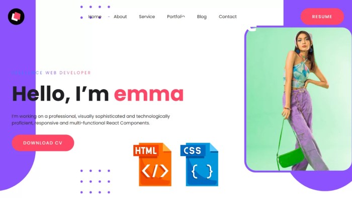
Source: codewithrandom.com
Creating the foundation for your dazzling portfolio website is easier than you think! We’ll walk you through building the basic HTML structure, crafting a slick navigation menu, and organizing your content into clear, easily digestible sections. Get ready to see your online presence take shape.
The core of every website is its HTML. Think of it as the skeleton, providing the structure for everything else. We’ll start by creating the basic HTML framework, then add the navigation and content sections. This process is straightforward and will form the bedrock of your portfolio.
Basic HTML Structure
The fundamental structure of an HTML document consists of the <head> and <body> sections. The <head> contains meta-information about the document, such as the title and character set, while the <body> contains the visible content of the webpage. Here’s the basic structure:
<!DOCTYPE html>

<html lang="en">

<head>

  <meta charset="UTF-8">

  <meta name="viewport" content="width=device-width, initial-scale=1.0">

  <title>My Portfolio</title>

  <link rel="stylesheet" href="style.css">

</head>

<body>

  <header>

    <nav></nav>

  </header>

  <main>

    <section id="about"></section>

    <section id="projects"></section>

    <section id="contact"></section>

  </main>

  <footer></footer>

</body>

</html>
Navigation Menu with Unordered Lists and CSS
A clean and intuitive navigation menu is crucial for user experience. We’ll use unordered lists (<ul>) to create the menu and CSS to style it. This approach is both simple and effective, allowing for easy customization.
Here’s the HTML for the navigation menu:
<nav>

  <ul>

    <li><a href="#about">About</a></li>

    <li><a href="#projects">Projects</a></li>

    <li><a href="#contact">Contact</a></li>

  </ul>

</nav>
And here’s the corresponding CSS:
nav ul

  list-style: none;

  margin: 0;

  padding: 0;

  text-align: center; /* Or left/right as per your design */
nav li
display: inline;
margin: 0 10px;
nav a
text-decoration: none;
color: #333;
Organizing Main Content Sections
Structuring your content logically enhances readability and . We’ll use <div> and <section> elements to organize the “About,” “Projects,” and “Contact” sections. Each section will contain its respective content, making it easy to manage and update.
<section id="about">

  <h2>About Me</h2>

  <p>Write your captivating bio here!</p>

</section>
<section id="projects">
<h2>My Projects</h2>
<p>Showcase your amazing projects here!</p>
</section>
<section id="contact">
<h2>Contact Me</h2>
<p>Add your contact information here!</p>
</section>
Styling with CSS
Okay, so you’ve got your basic HTML structure down. Now it’s time to make your portfolio website look amazing! This is where CSS (Cascading Style Sheets) comes in—your secret weapon for transforming a plain Jane website into a head-turner. We’ll cover responsive design, styling key elements, and creating a killer project showcase.
CSS allows you to control every visual aspect of your website, from font sizes and colors to layout and responsiveness. Think of HTML as the skeleton and CSS as the skin and clothes – it’s what gives your website its personality and style.
So you’re diving into the world of web design, learning how to build a personal portfolio website with HTML and CSS – awesome! But remember, even your digital presence needs safeguarding. Just like you need to protect your physical assets, consider the importance of securing your online business, perhaps by checking out this guide on How to Protect Your Business from Property Damage with Insurance to understand risk management.
Then, get back to crafting that killer portfolio website!
Responsive Design with CSS Media Queries
No one wants to squint at a website on their phone, right? Responsive design ensures your portfolio looks fantastic on any device, from tiny smartphones to massive desktop monitors. This is achieved using CSS media queries, which allow you to apply different styles based on screen size.
Here’s a snippet showing how to make your content fluid and adjust the layout based on screen width:
@media (max-width: 768px)

  body

    font-size: 16px; /* Smaller font for smaller screens */
.container
width: 90%; /* Make the container take up more of the screen */
margin: 0 auto; /* Center the container */
.project-item
width: 100%; /* Full-width project items on smaller screens */
@media (min-width: 769px)
/* Styles for larger screens */
.container
width: 80%;
margin: 0 auto;
.project-item
width: 48%; /* Two columns on larger screens */
margin: 1% 1%; /* Add some margin for spacing */
This code demonstrates a basic responsive layout. The @media rule targets different screen sizes. For screens smaller than 768 pixels (typical for tablets and phones), the font size is reduced, and the main container takes up almost the entire width. For screens larger than 768 pixels, the container is narrower, and project items are arranged in two columns. You can adjust these breakpoints and styles to perfectly fit your design.
Styling the Header, Footer, and Navigation Bar
These are the foundational elements of your website. A well-designed header, footer, and navigation bar create a consistent and user-friendly experience. Here’s how you can style them using CSS:
/* Header */

header

  background-color: #333;

  color: #fff;

  padding: 20px;

  text-align: center;
/* Navigation Bar */
nav ul
list-style: none;
padding: 0;
margin: 0;
nav li
display: inline;
margin: 0 10px;
nav a
color: #fff;
text-decoration: none;
/* Footer */
footer
background-color: #333;
color: #fff;
padding: 10px;
text-align: center;
This CSS provides a simple, dark-themed header and footer, and a horizontal navigation bar. You can customize colors, fonts, and spacing to match your personal brand.
Project Showcase with Flexbox or Grid
Your project showcase is the star of the show! Flexbox and Grid are powerful CSS layout modules that make creating visually appealing layouts a breeze. They offer flexible and efficient ways to arrange your project images and descriptions.
Let’s use Flexbox for a simple, responsive layout:
.projects

  display: flex;

  flex-wrap: wrap; /* Allow items to wrap onto multiple lines */

  justify-content: center; /* Center the items horizontally */
.project-item
width: 300px;
margin: 10px;
border: 1px solid #ccc;
padding: 10px;
.project-image
width: 100%;
height: auto;
This CSS creates a flexible container for your projects. The flex-wrap property ensures items wrap to the next line if necessary, while justify-content: center centers the items horizontally. Each project item has a consistent width, margin, and border for a clean look. You can easily replace the placeholder width with percentages for more responsive behavior or use Grid for more complex layouts.
Adding a Contact Form

Source: codewithrandom.com
A contact form is a crucial element of any portfolio website, providing a simple and direct way for potential clients or employers to get in touch. It’s a relatively straightforward process to implement using HTML, but careful consideration needs to be given to how you handle the submitted data.
Creating a simple contact form involves using HTML’s `
This code creates a form with fields for name, email, and a message. The `required` attribute ensures that these fields must be filled out before the form can be submitted. The `action=”#” ` is a placeholder; you’ll need to replace this with a valid URL or script that processes the form data.
Form Submission Handling
The `action` attribute in the above HTML code points to “#”, which is not a functional solution. You need a way to process the submitted data. There are several approaches:
* Server-Side Scripting: This is the most robust method. Languages like PHP, Python (with frameworks like Flask or Django), Node.js, or Ruby on Rails can receive the form data, process it (e.g., send an email notification), and provide feedback to the user. This requires setting up a server and configuring it to handle the form submissions.
* Third-Party Services: Services like Formspree, Mailchimp, or Google Forms offer simple ways to handle form submissions without needing server-side code. They provide an API key or a specific URL that you can use as the `action` attribute in your form. These services typically handle email delivery and other tasks for you.
The choice between server-side scripting and a third-party service depends on your technical skills and the complexity of your needs. If you’re comfortable with server-side programming, that offers the greatest control and customization. If you prefer a simpler solution, a third-party service is a good alternative.
Contact Form Styling with CSS
To make the contact form visually appealing and consistent with your website’s design, you’ll need to style it using CSS. Here’s some example CSS:
form

  width: 50%;

  margin: 0 auto;

  padding: 20px;

  border: 1px solid #ccc;

  border-radius: 5px;
label
display: block;
margin-bottom: 5px;
input[type="text"],
input[type="email"],
textarea
width: 100%;
padding: 10px;
margin-bottom: 10px;
border: 1px solid #ccc;
border-radius: 5px;
box-sizing: border-box;
input[type="submit"]
background-color: #4CAF50;
color: white;
padding: 10px 20px;
border: none;
border-radius: 5px;
cursor: pointer;
This CSS provides basic styling for the form, labels, input fields, and the submit button. You can customize these styles further to match your website’s design. Remember to link this CSS file to your HTML using a `` tag in the `
` section.Deploying Your Portfolio Website
So, you’ve painstakingly crafted your digital masterpiece – a portfolio website showcasing your skills. Now comes the exciting part: getting it online for the world to see! Deploying your website involves choosing a method to host your HTML and CSS files, making them accessible via a web address. Let’s explore your options.
Choosing the right deployment method depends on your technical skills, budget, and long-term goals. There are several popular methods, each with its own pros and cons.
Website Hosting Providers
Website hosting providers offer a comprehensive solution for deploying your website. They provide server space, technical support, and often additional features like email accounts and databases. Popular providers include Bluehost, HostGator, SiteGround, and many others. The process typically involves creating an account, uploading your website files via FTP (File Transfer Protocol) or a file manager provided by the hosting control panel, and configuring your domain name. This method offers great flexibility and control over your website’s functionality and appearance. However, it usually comes with a recurring monthly or annual fee.
GitHub Pages
GitHub Pages is a static website hosting service directly integrated with GitHub, a popular platform for version control and collaboration. If your portfolio is entirely static (meaning no server-side scripting like PHP or Node.js), GitHub Pages is a fantastic free option. It simplifies the deployment process significantly, directly publishing your website from a designated branch of your GitHub repository. This is ideal for beginners due to its ease of use and free nature. The drawback is limited customization options and scalability compared to a full-fledged hosting provider.
Uploading Your Website Files to a Hosting Provider
Here’s a step-by-step guide on uploading your website files using FTP (a common method):
- Choose an FTP Client: Download and install an FTP client like FileZilla (free and open-source) or Cyberduck (free and available for multiple operating systems).
- Obtain Your Hosting Credentials: Your hosting provider will provide you with FTP details: a server address, username, and password. These credentials grant you access to your server’s file system.
- Connect to Your Server: Open your FTP client and enter your server address, username, and password. Establish a connection.
- Upload Your Files: Navigate to the directory where your website files (index.html, CSS files, images, etc.) are located on your computer. Then, drag and drop or use the upload function to transfer these files to the designated directory on your server (usually the “public_html” or “www” folder).
- Verify Your Website: Once the upload is complete, open your web browser and type in your website’s address (provided by your hosting provider) to check if your website is displayed correctly.
Configuring a Custom Domain Name
A custom domain name (e.g., yourname.com) makes your website look more professional and memorable. To configure it, you’ll need to:
- Register a Domain Name: Purchase a domain name from a domain registrar like GoDaddy, Namecheap, or Google Domains.
- Obtain Nameserver Information: Your hosting provider will give you nameserver addresses (also known as DNS servers). These servers translate your domain name into the IP address of your hosting server.
- Update Your Domain Name’s DNS Settings: Log in to your domain registrar’s control panel and update the nameservers to match the ones provided by your hosting provider. This process can take a few hours or even up to 24 hours to propagate across the internet.
- Point Your Domain to Your Hosting Account: Some hosting providers may require additional steps to point your domain to the correct directory on their servers. Check your hosting provider’s documentation for specific instructions.
Remember, patience is key! Domain propagation can take some time. Once completed, your custom domain name will direct visitors to your awesome portfolio website.
End of Discussion
Building your own personal portfolio website with HTML and CSS isn’t just about showcasing your work; it’s about demonstrating your technical skills and creative vision. This guide has armed you with the fundamental knowledge to create a website that truly reflects your unique brand. Remember, practice makes perfect – so dive in, experiment, and watch your online presence flourish. Now go forth and build something amazing!


